Let me show you one of (if not the most) powerful tools in Lightroom that will completely elevate your editing: the Tone Curve. The Tone Curve gives you total control over light, contrast, and depth in your photos, letting you fix tricky lighting, fine-tune details, and shape your signature style with precision. Whether you're making subtle adjustments or creating bold, dramatic edits, this tool gives you the flexibility to bring your vision to life. Once you start using it, you’ll see just how versatile it really is.
Editing with intention starts here. When you start working with the Lightroom curves, you'll realize just how much control you have over your photos. It’s not just about brightening or darkening-it’s about shaping the exact mood and feel you want. And once you master that, your photos will pop in ways you never imagined.
What is the Tone Curve in Lightroom?
Imagine you’re in a recording studio, sitting behind the mixing board. The song is playing, but instead of turning up the volume for the whole track, you get to adjust the sound of each instrument individually to create the perfect mix. That’s exactly what the Tone Curve does for your photo. It gives you precise control over brightness and contrast in specific areas-like shadows, midtones, and highlights-without affecting the entire image.
The 5 Key Points of the Tone Curve Explained
In this section, we’ll break down the five key points of the Tone Curve-whites, highlights, midtones, shadows, and blacks. By adjusting these areas, you have total control over the brightness and contrast in your photos, helping you shape your unique style. We’ll explore how each adjustment helps you achieve different looks, like:
- Crisp & Bright or Soft & Balanced
- Light & Airy or Smooth & Creamy
- Filmy and Vintage
- Cinematic and Moody
Whites
Whites control the brightest parts of your photo, such as the glow of sunlight, bright clothing, or reflections on water. Raising the whites makes the brightest areas even brighter, giving your image a clean, polished look. This is great for modern, high-contrast edits where you want whites to pop, but pushing it too far can make highlights harsh or blown out. For a true film-inspired look, try lowering the whites point slightly to mimic the gentle highlight fade of film.
Highlights
Highlights control the lighter tones in your photo that aren’t pure white. Increasing highlights brightens the lighter parts for a fresh, airy vibe; lowering highlights restores detail in bright areas for a smooth, dreamy, or film-like effect.
Midtones
Midtones are the heart of your image, where most color and detail reside. Raising midtones brightens the image evenly for a fresh, natural feel, while lowering midtones creates a deeper, more dramatic look for mood and contrast.
Shadows
Shadows govern the darker parts of your photo. Raising shadows reveals hidden details and softens the overall balance; lowering shadows deepens contrast for a bold, dramatic look.
Blacks
Blacks affect the deepest shadows. Lowering blacks makes the darkest areas even darker for a crisp, high-contrast appearance, while raising blacks softens the deepest parts for a faded, film-like, organic feel.
How They Work Together
Now that you know what each part does, it’s time to talk about how they work together. Think of the Tone Curve as a light dimmer with multiple controls. Instead of just brightening or darkening your entire room, you have separate dimmers for different areas-one for the ceiling lights, another for the lamps, and one for the candle glow. The combination of all these controls creates the exact mood you want.
Want to see this in action? → Watch Here
Locating the Tone Curve Panel
In Lightroom Desktop, head to the Develop module. On the right-hand panel, you’ll see the Tone Curve located just below the Basic panel.
Finding the Tone Curve in Lightroom Mobile: open your image in the Lightroom Mobile app, tap the Edit icon, select the Light Panel, and tap on Tone Curve to access the curve graph.
Creating an S-Curve for Contrast
One of the most common adjustments is the S-curve. Lower the shadows (bottom-left of the curve) and lift the highlights (top-right of the curve). This creates a natural contrast by deepening the shadows and brightening the lightest areas, adding dimension and depth to your image.
Fine-Tuning with Points
You can create adjustable points directly on the Tone Curve by clicking on it. Each point lets you target specific tonal ranges for more precise control. Raise or lower points to fine-tune your edit.
Using the RGB Channels for Color Grading
The Tone Curve isn’t only about light and contrast-it’s also a powerful tool for color grading. With the RGB channels, you can adjust the Red, Green, and Blue channels individually to craft a distinctive aesthetic. Color grading adds warmth, mood, or a cinematic vibe that defined looks rely on.
What’s happening when you adjust RGB? Each channel acts like a color filter. Red boosts red tones in shadows, midtones, or highlights; Green adds earthy tones; Blue introduces cooler tones. Lowering blue lends warmth, while raising red or green can accentuate certain hues.
Why Use the Tone Curve in Lightroom?
The Tone Curve lets you achieve both subtle and dramatic changes, from moody vibes to vintage film looks. It’s especially useful for documentary-style photographers who rely on light and shadow to convey emotion. Quick tip: experiment with presets to save time, then tailor the tone curve points to your taste.
Presets can provide a solid base, such as the Natural or Modular Preset Pack, and from there you can adjust the tone curve to customize shadows, highlights, and midtones. This helps you bring your creative vision to life while saving time in post-processing.
Tutorial Lightroom: MENGENAL TONE CURVE!
Practical Notes and Next Steps
Editing with the Tone Curve is not about brute force-it’s about shaping the exact mood you want. Play with whites, highlights, midtones, shadows, and blacks together to craft the atmosphere of your image. Consider how color grading via RGB channels can tilt the final look toward vintage warmth or cool cinematic tones. With practice, the Tone Curve becomes a natural extension of your creative vision.
Tutorial Lightroom: MENGENAL TONE CURVE!
Additional Resources and Mentorship
If Lightroom feels overwhelming or you’re aiming for a consistent look, working with mentorship sessions can help you achieve your dream editing style step by step. You’ll learn how to confidently create the look you want, from fundamentals to advanced color grading and curve manipulation.
Quick note: you can combine Tone Curve adjustments with presets to streamline your workflow and still personalize the result to your taste. This approach gives you the precision of curves with the efficiency of presets.

Practical Examples and Use Cases
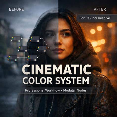
Creating a cinematic vibe often involves a careful balance of contrast and color grading. By shaping the curve to emphasize shadows and midtones, then nudging the RGB channels for a cool, desaturated blue in the highlights and a warmer red in the shadows, you can achieve that moody, filmic look that resonates with cinematic storytelling.
Documentary-style editors may favor a restrained S-curve to preserve detail across the tonal range, ensuring the image reads truthfully while still carrying emotional weight. The Tone Curve empowers you to tailor the brightness in specific tonal ranges without globally altering exposure.
Tutorial Lightroom: MENGENAL TONE CURVE!
- Open Tone Curve in Lightroom Desktop or Mobile.
- Experiment with an S-curve for contrast.
- Add points for targeted tonal control.
- Adjust RGB channels for color grading.
- Refine with subtle tweaks to whites and blacks for the final mood.