Figma’s color picker lets you sample any hue from an image and instantly add it to your design. Open your palette in Figma to create gradients, maintain color harmony, and build custom color schemes in a few clicks. Upload any image, and Figma’s color picker will automatically generate palettes. Simply upload an image or select one from the gallery for inspiring color schemes available in HEX, RGB, HSB, and HSL color codes.
What color theory is and how it helps your design
Color theory helps artists, graphic designers, and product teams figure out how colors work together to achieve color harmony. This framework helps creatives choose a color palette that stirs up emotions, leaving a lasting impact on audiences. In product design, color isn’t just decorative; designers use color strategically to communicate messages, influence users’ emotions, and shape perceptions about a brand. Once you know the basics of color theory, you can design color schemes that boost engagement-and the bottom line.
Color theory breaks down how colors work in harmony, so designers can make color choices that appeal to users and elevate the brand. A palette generator can help designers explore color palettes, but how do you know when you’ve found the right one?
How to read a color wheel and spot three main types of colors
The color wheel defines three main color types: Primary colors (red, yellow, blue), Secondary colors (orange, green, violet), and Tertiary colors (red-orange, yellow-orange, yellow-green, blue-green, blue-violet, red-violet). The origins of the modern color wheel trace back to Sir Isaac Newton’s experiments with light and the 1704 Opticks, which laid the foundation for color theory with the color wheel at its center.
Primary, secondary, and tertiary colors
Primary colors serve as the base for all other colors when combined. Secondary colors arise from mixing two primary colors. Tertiary colors result from mixing a primary color with a secondary color. Understanding these relationships helps you predict color interactions and craft harmonious palettes.
Seven harmonious color schemes you can achieve with color mixing
- Analogous color scheme: Three colors that sit next to each other on the wheel (e.g., blue, blue-green, green). Choose one as main, a second as supporting, and a third as accent.
- Monochromatic color scheme: Shades and tints of a single color for a cohesive look; can range from black to gray or focus on another vivid hue (e.g., Barbie® pink).
- Complementary color scheme: Two colors opposite each other on the wheel (e.g., yellow and purple, red and green, blue and orange) for high contrast and visibility.
- Split-complementary color scheme: A base color with its two adjacent colors to a complementary color, offering broader palettes with balanced contrast.
- Triadic color scheme: Three colors evenly spaced around the wheel; creates vibrant, balanced designs.
- Tetradic color scheme: A rectangle on the wheel connecting two sets of complementary pairs; maximizes contrast and variety.
- Square color scheme: Four colors forming a square on the wheel for rich, diverse palettes with careful calibration to maintain balance.
Leading with color psychology and hue nuances
Color temperature influences emotion and perception: warm colors (reds, oranges) convey energy and excitement, while cool colors (blues, teals) promote trust and calm. Brands often rely on a signature color paired with neutral backgrounds to express identity and mood. Fine-tuning hue, value, and saturation helps you dial in the exact feel you want. For example, a bold red might communicate urgency, while a muted red could support readability and sophistication.
Fine-tuning color hue, value, and saturation
Color theory focuses on hue (the color itself), value (lightness), and saturation (vibrancy). On advanced color wheels, you can see how these elements interact across primary, secondary, and tertiary colors. Adjusting saturation and value can tone down or intensify a hue to meet contrast and accessibility needs. The right balance supports readability, accessibility, and brand alignment.
RGB vs. CMYK and choosing the right model for your work
RGB is an additive color model using red, green, and blue to create over 16 million colors for digital designs. CMYK uses subtractive colors (cyan, magenta, yellow, black) for print production, offering about 16,000+ color combinations. For mobile apps and screens, RGB is typically preferred; for print materials, CMYK provides predictable results and print fidelity.
Finesse your color palette with Figma
Whether you’re refreshing a brand or launching a new product, Figma’s design resources help you craft a brand color palette. Hammer out design goals with FigJam’s online collaborative whiteboard, and apply Figma's research templates to collect user research and stakeholder input for your designs. The color picker can sample from images to generate palettes in HEX, RGB, HSB, and HSL, making it easy to replicate color harmony across components and UI.
Looking for inspiration? Hi friends, Mickey from Figma here. And today we're going to make a color wheel in Figma and talk about the hex values that make up the colors in that color wheel. So when you think about that hex code, there’s going to be 6 digits. The 1st 2 digits represent the red, the 2nd 2 digits represent the green, the 3rd 2 digits represent the blue. The way that they work is the amount of color in each paint bucket, representing each pair of numbers. The hex code can represent about 16.7 million colors, which comes from 256 values per channel (0-255). Mixing colors on screen uses an additive color model, where red, green, and blue combine to form all visible hues. Opponents on the color wheel-such as red vs cyan, green vs magenta, and blue vs yellow-define contrasting pairs that, when combined, can approach white. A color wheel can be constructed with a circular gradient, using an angular gradient type and evenly distributed color stops to form a smooth wheel.
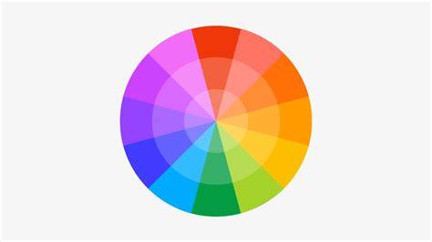
In practice, you can sample any hue from an image and add it to your design, then fine-tune with hue, saturation, and lightness to meet accessibility and branding goals. The RGB model explains how primary colors combine on digital displays, while CMYK remains the standard for print. Figma’s color picker workflow helps designers convert and translate colors across digital and print contexts, keeping cohesion across platforms.
RGB and HSL provide alternative views of the same color values as HEX. Converting between them helps designers communicate color specifications to developers and printers. Understanding color profiles like sRGB and Display P3 ensures consistent appearance across devices, with P3 offering broader color spaces but potentially higher power usage on devices not built for wide gamut rendering.
| Color model | Use case | Key notes |
|---|---|---|
| RGB | Digital screens | Additive, 16M+ colors |
| CMYK | Subtractive, pigment-based | |
| HSL | Color tuning | Hue, saturation, lightness |
| sRGB | Web standard | Broad compatibility |
| Display P3 | Valuable for high-end displays | Wider gamut, more vibrant |
WCAG accessibility emphasizes sufficient contrast to ensure readability for users with visual impairments. Designers should aim for contrast ratios that meet or exceed WCAG guidelines to create inclusive interfaces. Figma supports color decisions aligned with WCAG recommendations and best practices for accessible design.