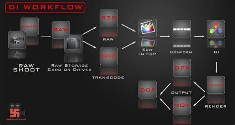
Color correction and color grading are essential tools in post-production that can transform footage, set the mood, and support the narrative. There is a notable distinction between correcting footage to a neutral baseline and styling it to convey a specific aesthetic. When done thoughtfully, grading preserves skin tones, maintains coherence across shots, and enhances storytelling; when done poorly, it can push skin tones into undesired regions, create distracting color casts, or undermine realism.
Foundations: correction versus grading
There is a difference between color correcting and color grading. With color correcting you get the correct white balance/exposure (curves) between your shots as to assure that they "flow". Color grading is to create a more aesthetically pleasing image, relevant to the narrative and scene.
Color correction, however, is a technical process that adjusts hue, saturation, and brightness to bring overall color in line with the human eye. White balance is a process to attain a true white in an image or video so that all the other colors fall in the right areas. Exposure is the measure of how bright or dark the footage or photo is. To set it at its proper exposure, adjust levels of brightness, contrast, highlights, shadows, whites, and blacks.
Color grading is an artistic process of adjusting color in a photo or video to create a stylized tone and mood. It sets the final look and feel of a film or portrait. Split toning is a quick way to apply a specific color onto the lights and darks of an image or video, without affecting brightness or amounts of shadows and whites. This allows one color to be added to a certain highlighted area and another to a darker one.
There are tools and concepts that help ensure consistency across devices and scenes: scopes (waveforms, RGB parade, and vectorscope) guide exposure and hue decisions; LUTs (Lookup Tables) provide repeatable starting points or stylized looks; and calibration LUTs ensure uniform colors across the editing and coloring process. The transformation LUT maps colors from one color space to another, while log normalization LUTs tone-map log footage into standard color spaces like Rec. 709 or cinematic spaces.
Why middle grey, and how adjustments typically flow
It's common in grading workflows to anchor adjustments around middle grey and then push into shadows or highlights. Going down a bit from middle grey for shadows (e.g., cooler shadows) or moving up toward whites for highlights (e.g., warmer highlights) is a practical convention that helps preserve skin tones and maintain a believable range. The idea is to design a transform that maps sensor data to a standardized output without pushing skin tones into the shadow region or floods of color.
Some practitioners argue that a REC709 transform alone will not universally look good, because the real power of grading lies in shaping color in service of mood and narrative rather than adhering to a strictly neutral, technician’s standard. A well-balanced, context-aware grade can be more engaging than a technically perfect but aesthetically flat image.
Historical context and the role of standards
Until recently, video was dominated by a vast array of technical standards that were inflexible. Early systems like 2K/DIs and the evolution of HD and 2K workflows shaped how color was managed, tied to the capabilities of hardware and the expectations of engineers. The concept of “making a killer LUT” is a distant goal for many creators, whereas mastering proper color correction and thoughtful grading remains central to how a shot communicates with the audience.
Shooting workflows-whether LOG, RAW, or standard gamuts-define the starting point for grading. If you shoot log or raw, grading becomes essential to shape the look; if you shoot in standard gamma and gamut, there is still room to craft a distinct mood, but with different constraints.
Practical considerations: when to grade, and what to watch for
Color correction will almost certainly be needed, no matter how well you white balance and light, because changing lighting and camera conditions across takes introduces shifts in white balance, exposure, blacks, and highlights. You may need to inspect final clips in waveform monitors, vectorscopes, and RGB parades to ensure the image is “safe” for distribution.
Color grading is not only about technical accuracy; it’s about emotional and narrative relevance. Warm palettes (orange, red) tend to feel inviting and soft, while cool palettes (blue) can feel clinical or raw. High contrast can intensify tension, while low contrast can soften the mood. Saturation levels similarly shape the perceived vibrancy or desolation of a scene. The further color moves from neutral balance, the more stylized the image becomes.
Documentaries often favor color correction for accuracy, while narrative films may embrace stylization. However, even in documentary work, a controlled palette helps audiences believe the image is intentional and truthful rather than arbitrary.
Workflow tips for good color timing
- Establish a strong baseline: correct white balance and exposure across shots to ensure a cohesive sequence.
- Use scopes to verify color and luminance across devices; adjust primary corrections before moving to grading decisions.
- Decide on a mood early, then implement a consistent color language (temperature, contrast, saturation) that supports the narrative.
- Apply LUTs or look presets judiciously as starting points, then refine through manual grading to taste and context.
- Plan test grades before shooting when possible to avoid costly re-shoots or lengthy post revisions.
Common debates and misconceptions
Some filmmakers question the necessity of grading if lighting and white balance are decent. Yet most agree that color timing-both correction and grading-plays a crucial role in shaping mood, guiding the viewer’s perception, and ensuring consistency across scenes.
It is a mistake to conflate “technical accuracy” with “emotional truth.” A technically perfect but emotionally flat image may fail to engage the audience, while a stylized but coherent palette can dramatically amplify narrative impact.
Additional resources and tools
Understanding the roles of features like color wheels, histograms, RGB parade, and split toning helps in practical decision-making. Learning from authoritative references such as the Color Correction Handbook and Van Hurkman’s guidance can provide structured methodologies for both beginners and seasoned colorists. Even with robust hardware and software, the essential craft remains learning how to balance and shape color in service of storytelling.