Up until 2020, blend modes were a feature I hadn’t used much because I rarely ever had any idea what result they could produce without giving them a try first. The problem stemmed from not really knowing how they work in the back. Pretty much every article I’ve seen on the topic is based on examples, comparisons with Photoshop or verbose artistic descriptions. I find examples great, but when you have no clue how things work in the back, adapting a nice-looking demo into something that would implement a different idea you have in your head becomes a really time-consuming, frustrating and ultimately futile adventure.
Then Photoshop comparisons are pretty much useless for someone coming from a technical background. So I had a lightbulb moment when I came across the spec and found it also includes mathematical formulas according to which blend modes work. This meant I could finally understand how this stuff works in the back and where it can be really useful. Blending means combining two layers (that are stacked one on top of the other) and getting a single layer. These two layers could be two siblings, in which case the CSS property we use is mix-blend-mode. They could also be two background layers, in which case the CSS property we use is background-blend-mode.
Note that when I talk about blending “siblings,” this includes blending an element with the pseudo-elements or with the text content or the background of its parent. When blending two layers, the layer on top is called the source, while the layer underneath is called the destination. This is something I just take as it is because these names don’t make much sense, at least to me. How exactly we combine the two layers depends on the particular blend mode used, but it’s always per pixel.
Alright, but what happens if we have more than two layers? In a first stage, the second layer from the bottom is our source, and the first layer from the bottom is our destination. These two layers blend together and the result becomes the destination for the second stage, where the third layer from the bottom is the source. Of course, we can use a different blend mode at each stage. For example, we can use difference to blend the first two layers from the bottom, then use multiply to blend the result with the third layer from the bottom. The result produced by the two blend modes we discuss here doesn’t depend on which of the two layers is on top. They are also separable blend modes, meaning the blending operation is performed on each channel separately.
Something to keep in mind is that RGB values can be represented either in the [0, 255] interval, or as percentages in the [0%, 100%] interval, and what we actually use in our formulas is the percentage expressed as a decimal value. For example, crimson can be written as either rgb(220, 20, 60) or as rgb(86.3%, 7.8%, 23.5%) - both are valid. If a pixel is black, the channel values we use for computations are all 0, since black can be written as rgb(0, 0, 0) or as rgb(0%, 0%, 0%).
The name of this blend mode might provide a clue about what the blending function fB() does. First off, this means that if the corresponding pixels in the two layers have identical RGB values (i.e. i.e. identical), the result is that the mode produces a specific outcome. This becomes evident in interactive demos where you toggle between viewing layers separated and overlapped and blended.
The above looks like we’ve messed things up… but have we really? What we have here is a gold rectangle on top of gold text. Note that we have to isolate the paragraph to prevent blending with the body background. While this is only an issue in Firefox (and given we have a very dark background on the body, it’s not too noticeable) and is fine in Chrome, keep in mind that, according to the spec, what Firefox does is actually correct.
We can blend two background layers instead of blending the text content and a pseudo. Note that we don’t even have a pseudo-element anymore, so we’ve taken some of the CSS on it, moved it on the link itself, and tweaked it to suit this new technique. The first problem is one you’ve surely noticed if you checked the caption’s live demo link in Firefox: it doesn’t work at all. The second problem is one that’s noticeable in the recording. The links seem somewhat faded. Even more weirdly, setting isolation: isolate on the link or its parent paragraph doesn’t stop this from happening.
I still had a nagging feeling it must have something to do with context, so I decided to keep throwing possible hacks at it, and hope maybe something ends up working. Well, I didn’t have to spend much time on it. The final problem is another one that’s noticeable in the recording. If you look at the ‘r’ at the end of “Amur” you can notice its right end is cut out as it falls outside the background rectangle. And what do you know, it can be fixed! Note that box-decoration-break still needs the -webkit- prefix for all WebKit browsers, but unlike in the case of properties like background-clip where at least one value is text, auto-prefixing tools can take care of the problem just fine.
Another suggestion I got was to add a negative margin to compensate for the padding. I’m going back and forth on this one - I can’t decide whether I like the result better with or without it. Still, I have to admit that animating just the background-position or the background-size of a gradient is a bit boring. But thanks to Houdini, we can now get creative and animate whatever component of a gradient we wish, even though this is only supported in Chromium at the moment.
This is the sort of effect I often see achieved by either using element duplication - the two copies are layered one on top of the other, where one of them has an invert filter and clip-path is used on the top one in order to show both of layers. Both these approaches get the job done if we want to invert a part of the entire element with all its content and descendants, but they cannot help us when we want to invert just a part of the background - both filter and backdrop-filter affect entire elements, not just their backgrounds. This is where blending comes in.
The technique is pretty straightforward: we have a background layer, part of which we want to invert and one or more gradient layers that give us a white area where we want inversion of the other layer and transparency (or black) otherwise. Then we blend using one of the two blend modes discussed today. Here’s a first example. We have a square element that has a two-layer background. This gives us the following result. You probably know the interactive before-and-after image sliders. You may have even seen something of the kind right here on CSS-Tricks. Our element is going to be a range input. We don’t set its min or max attributes, so they default to 0 and 100, respectively.
In the CSS, we start with a basic reset, then we make our input a block element that occupies the entire viewport height. It’s starting to look like something, but dragging the thumb does nothing to move the separation line. This is happening because the current value, --k (on which the gradient’s separation line position, --p, depends), doesn’t get automatically updated. But is it really? When we set --p to calc(var(--k)*1%), the separation line moves from 0% to 100%. It should really be moving from a starting point that’s half a thumb width, $thumb-r, until half a thumb width before 100%. That is, within a range that’s 100% minus a thumb width, $thumb-w. We subtract a half from each end, so that’s a whole thumb width to be subtracted. But the way range inputs work, their border-box moving within the limits of the track’s content-box (Chrome) or within the limits of the actual input’s content-box (Firefox)… this still doesn’t feel right.
We cannot change how range inputs work, but we can make the input extend outside the viewport by half a thumb width to the left and by another half a thumb width to the right. We could also use a vertical slider. This is slightly more complex as our only reliable cross-browser way of creating custom styled vertical sliders is to apply a rotation on them, but this would also rotate the background. The inverted area of the background doesn’t necessarily have to be created by a gradient. The blending technique for inversion is more powerful than using filters in more than one way. It also allows us to apply the effect gradually along a gradient.
The first method, which works for both difference and exclusion is setting the alpha channel of our white to p. What we got is exactly the formula for exclusion where the other channel is p! Note that using a gradient from black to white for gradual inversion only works with the exclusion blend mode and not with the difference. The result produced by difference in this case, given its formula, is a pseudo gradual inversion that doesn’t pass through the 50% grey in the middle, but through RGB values that have each of the three channels zeroed at various points along the gradient. That is why the contrast looks starker.
Gradual left-to-right inversion vs. Having different levels of inversion across a background doesn’t necessarily need to come from a black to white gradient. It can also come from a black and white image as the black areas of the image would preserve the background-color, the white areas would fully invert it and we’d have partial inversion for everything in between when using the exclusion blend-mode. Wherever the top layer is black, the result of the blending operation is identical to the other layer, whether that’s black or white. Wherever the top layer is white, the result of the blending operation is identical to the other layer inverted. The way Chromium behaves is a bug, but that’s the result we want.
Of course, we can also simplify things and make the two blended layers be background layers on the element instead of its pseudos. The basic idea is we have a scene that’s half black and half white, and a white item moving from one side to the other. We won’t be going into details about the “how” behind these demos as the basic idea of the blending effect using exclusion or difference is the same as before and the geometry/animation parts are outside the scope of this article.
We’re not necessarily limited to just black and white. And if we want something milder like dark grey shapes on a light grey background, we don’t go for full inversion, but only for partial one. It doesn’t necessarily have to be something like a looping or loading animation. We can also have a XOR effect between an element’s background and its offset frame. Another example would be having a XOR effect on hovering/ focusing and clicking a close button.
- The first tactic would be to use filters. We can break free from the black and white constraint by using sepia() after lowering the contrast (as this function has no effect over pure black or white).
- The second tactic would be to add another layer, one that’s not black and white. Another option would be blending the entire wrapper again with another layer, this time using a blend mode different from difference or exclusion.
- Doing so would allow us more control over the result so we’re not limited to just complementaries (like black and white, or purple and green).
Finally, there’s the option of using difference (and not exclusion) so that we get black where two identical (not necessarily white) layers overlap. For example, the difference between coral and coral is always going to be 0 on all three channels, which means black. Note that this means we also have to invert the image background when we invert the element in the second theme scenario. Just these two blend modes can help us get some really cool results without resorting to canvas, SVG or duplicated layers. But we’ve barely scratched the surface here. In future articles, we’ll dive into how other blend modes work and what we can achieve with them alone or in combination with previous ones or with other CSS visual effects such as filters.
I have searched all over for a solution to this issue I am having. For some reason, some of the frames in my Figma file are appearing differently despite having all the same properties applied to them in the design settings. After doing a short deep dive, I found that one of the frames had a “background-blend-mode” while the other had a “mix-blend-mode.” This is creating a ton of issues as these two blend modes do not have the same appearance regardless of which blend type is selected, and it also affects the text.
Blend modes essentials: If you have ever used any image editing software like Adobe Photoshop, Affinity Photo or Sketch App you probably have some experience with blend modes. Yes - it is one of those features that designers love as it’s essentially a shortcut method for doing beautiful things but front-end developers hate them because they are laborious to implement. A-ha! Not anymore! I will show you how in a second but first let’s brush up on some theory courtesy of Wikipedia. Blend modes in digital image editing are used to determine how two layers are blended into each other. However, as each pixel has a numerical representation, a large number of ways to blend two layers is possible.
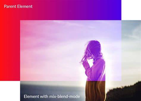
Photoshop and Sketch separate blending options into groups. CSS blend modes per the Compositing and Blending Level spec include 16 values and two main properties: background-blend-mode and mix-blend-mode. The effect that those properties produce is identical but the use case for them is different. background-blend-mode applies to background-color or background-image; mix-blend-mode applies to the contents of an element blending with the backdrop.
In practice, you can create see-through text, invert parts of a background, or blend overlapping SVG elements. There’s a need to consider stacking contexts and isolation: applying a blend mode establishes a new stacking context, and an element with blending must blend with all underlying content of its context. If you use background-blend-mode, isolation is not needed because background layers must not blend with the content behind the element, they act as an isolated group.
Browser support varies: mix-blend-mode is less widely supported than background-blend-mode, and non-separable blend modes like hue, saturation, color, luminosity can behave differently across browsers. As of the spec, the web platform continues to evolve, but practical usage shows that blending is a powerful tool for achieving sophisticated visual effects with CSS alone, without canvas or heavy scripting.
One particularly interesting effect you can create is see-through text. The following image shows this effect in action. That’s pretty cool, isn’t it? It is worth noting here that the colors you choose strongly affect the end result. In the interactive demo, you have an option to add editable text to the preview area, and then style that text and blend it with the preview image using mix-blend-mode.
Create Transparent Text Effect in Canva – Easy Canva Tutorial
According to the specification, applying a blend mode other than normal to the element must establish a new stacking context on that element, forming a group. Also, an element that has blending applied, must blend with all the underlying content of the stacking context that that element belongs to. For example, the following image shows the result of mix-blending two images with the overlay mode. I’ve wrapped the image on top (the .source) in a div that I’m going to create a stacking context on. This brings us to the isolation property.
But before we move on, note that the mix-blend-mode property also applies to SVG elements, and can be used to blend overlapping SVG elements together as well. Browser support for the mix-blend-mode property is not as wide as that of the background-blend-mode property. When a property that leads to the creation of a stacking context is applied to an element, that element is said to be isolated. In SVG, this property defines whether an element is isolated or not. For CSS, setting isolation to isolate will turn the element into a stacking context, and thus affect whether or not the element’s contents can blend with their backdrop lying outside this context. This has the same effect as using opacity in the previous example.
Note that by creating a stacking context on an element, you are isolating the content of that element and preventing them from blending with the backdrop of that element. Moreover, If you are using the background-blend-mode property, the isolation property is not needed since background layers must not blend with the content that is behind the element, instead they must act as if they are rendered into an isolated group (the element itself), as specified in the specification. CSS blending modes, filters and masks, can all be applied to the same element. The web platform team at Adobe have been doing a tremendous job bringing many of their tools’ graphical capabilities to the web.
In summary, mix-blend-mode controls how an element’s content blends with the backdrop and is subject to stacking contexts, while background-blend-mode controls how background layers blend with each other or with the background color of the element. Both provide powerful, expressive possibilities for typography, imagery, and interactive UI effects when used with careful consideration of browser support and performance constraints.