If you've ever shipped a feature that looked perfect in Figma but felt "off" in code, you know the pain: design tokens don't match Tailwind's theme, component states are missing, and developers spend hours deciphering spacing and variants. The right Figma kit fixes that. This guide is a practical, no-hype rundown of six Figma kits built for Tailwind workflows. Some are free and enormous. Others are premium and focused on speed from design to code. A few follow the "un-library" model (copy component source into your app for full ownership). Others ship as classic dependencies for quick starts.
Design-to-code fidelity and workflow: mapping in practice
Design-to-code fidelity & workflow - How closely do Figma variants map to Tailwind utilities or code components? Customization vs. cost-value - One-time vs. This is the premier Figma counterpart to shadcn/ui with a sharp focus on workflow. The Figma kit mirrors shadcn/ui components and states, is deeply tokenized with Figma Variables (light/dark, radii, spacing, brand palettes), and supports multi-brand systems. Where it really separates itself is tooling: the AI-assisted Figma plugin exports CSS variables from Figma → code, imports tokens from code → Figma (preventing drift), and can generate shadcn/ui component code from selected frames.
The kit now ships as six dedicated style files - Nova, Vega, Mira, Luma, Maia, and Lyra - matching the styles available in shadcn/create, so you start from a Figma file that already matches your shadcn/ui project's proportions and density instead of retheming after the fact. One-time tiers. Untitled UI is huge: 10k+ components/variants, 900+ styles, and 420+ page examples in the PRO tier, plus a neutral visual language that adapts to almost any brand. The big update: Untitled UI React ships a Tailwind CSS v4.2 + React Aria component library designed as a 1:1 match with the Figma kit and follows the ownership model (no npm lock-in). One-time, per-seat tiers, priced separately for Figma and React. Flowbite straddles the best of two worlds: open-source Tailwind components (HTML + JavaScript for interactions) and a Figma design system that mirrors Tailwind's defaults closely (tokens, variants, dark mode).
Preline is the "how is this free?" option: 840+ components, 220+ sections, templates, and headless JS plugins all strictly Tailwind-idiomatic. Free code + free Figma; paid Pro expands templates/components. DaisyUI is a Tailwind plugin that adds semantic component classes (.btn, .card, .alert) on top of utilities. You retain Tailwind's flexibility while significantly reducing markup noise. TailGrids ships code snippets for HTML, React, and Vue alongside a matching Figma kit. That alone saves hours when a client stack changes mid-project. The library is broad: 600+ components/blocks/templates in full; a free, open-source edition to start. Free open-source edition (no Figma file). Not as opinionated on design-to-code automation; you assemble from snippets (which many devs prefer).
Kit-by-kit overview and what to expect
- Untitled UI - Exhaustive coverage with 10k+ components/variants; 900+ styles and 420+ pages in PRO; 1:1 alignment with Tailwind workflows; offers React integration and ownership model, enabling off-NPM usage without lock-in.
- shadcndesign.com / shadcn/ui-aligned kits - The premium tier with AI-assisted token syncing and code generation; deep tokenization; rapid handoff reduction; six style files (Nova, Vega, Mira, Luma, Maia, Lyra).
- Preline - Free code plus free Figma; Pro expands templates and components; broad tailwind-idiomatic components and sections.
- DaisyUI - Tailwind plugin that adds semantic component classes; preserves Tailwind flexibility while reducing markup noise.
- TailGrids - Code snippets for HTML, React, Vue; open-source edition to start; supports quick adaptation to client stacks.
- FlyonUI - Official Tailwind Figma design system with 1000+ component variants, 500+ blocks, 4 themes; drag-and-drop builder; AI-inspired token and component syncing; free open-source base with Pro adds scalability and templates.
Each kit presents a different balance of ownership, speed, and design-to-code fidelity. The common thread is a commitment to aligning Figma components, tokens, and variants with Tailwind utilities and a coherent code component story for developers. Some kits emphasize deep tokenization and AI-assisted exports; others focus on broad component libraries and rapid prototyping without heavy dependency management.
Choosing the right kit for your team
- Ownership vs. dependency: If you want full control with minimal graduation risk, consider the “un-library” approach or ownership-forward kits that ship as standalone blocks or 1:1 code matches.
- Token synchronization: Kits with token export/import between Figma and code help prevent drift and speed handoffs-especially when teams iterate on brand colors, radii, and spacing.
- Scale and maintenance: For large teams, a kit offering multiple themes, pronounced design tokens, and a consistent component model helps maintain design system integrity across projects.
- Accessibility and density: Look for kits with accessible component variants and density-matched scales to ensure parity between design and implemented UI.
Practical workflow tips
- Start from a kit whose styles match your target project (Nova, Vega, Mira, Luma, Maia, Lyra, or similar) to reduce retheming time.
- Leverage token exports: use AI-assisted plugins to export CSS variables from Figma and to import tokens back into Figma to prevent drift.
- Map variants to Tailwind utilities as much as possible to minimize custom CSS and maximize reusability.
- Use prebuilt templates and components to accelerate prototyping and maintain consistent UX patterns across pages.
- Decide early between an “un-library” approach vs. a dependency-based setup, then align your design tokens, typography scales, and color systems accordingly.
Illustrative components and patterns to prototype
Prototype a real screen to test fidelity: pick a button, input, and a date picker; toggle themes; and prototype a small dashboard with a settings panel and a data table. This helps verify how every component responds across breakpoints and if the design system scales across product areas.
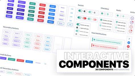
Prototype a screen with multiple states (default, hover, active, focus, disabled) to ensure your kit covers interactive variants comprehensively. Compare the resulting code structure with your Tailwind setup to confirm that the tokens and sizes map consistently across components.
Tailwind Sync: First-Time Setup (Figma to Tailwind CSS)
Finally, assess documentation clarity: is it easy for designers and developers to onboard after choosing a kit? A solid design system in Figma paired with a well-documented Tailwind workflow dramatically reduces handoff friction and speeds feature delivery.
Recommendations
- Pick Untitled UI if you want exhaustive coverage, a ready React/Tailwind library, and strong ownership parity.
- Choose shadcndesign.com for AI-driven token synchronization and a direct mapping to shadcn/ui components.
- Consider Preline or DaisyUI if you want free, broad options with reliable Tailwind integration and a gentle learning curve.
- Explore FlyonUI if you value a drag-and-drop builder, 4 pre-built themes, and extensive component variants with a clear upgrade path.
- Evaluate TailGrids if you need code snippets across frameworks and prefer an open-source starting point without a Figma file.
Un-library approaches are gaining mindshare: copy-in code (shadcn/ui, Untitled UI React) as a strategy to install ownership and reduce dependency churn. AI tooling is moving beyond snippets to full component code generation and token synchronization, reinforcing the case for choosing a kit that aligns with your team's philosophy and process.