In the world of printing, the term CMYK is foundational. At Foote Printing, we know how crucial it is to understand these colors-cyan, magenta, yellow, and key (black)-when it comes to achieving the perfect print. Whether you're a designer or someone new to printing, getting familiar with these terms can make a significant difference in the quality of your projects.
The Meaning Behind CMYK
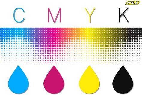
CMYK is a color model used in color printing. It stands for Cyan, Magenta, Yellow, and Key (K). These colors are combined to create a range of colors as can be seen on the CMYK color wheel. They are also known as process colors or four-color process since four different plates are used (one plate each for cyan, magenta, yellow and key).
CMYK uses subtractive colors when printing. This means the final print begins with a background that is already white (like a sheet of paper). Color is then added to the white background to achieve various light and dark shades. Lighter shades are created by using cyan, magenta, and yellow.
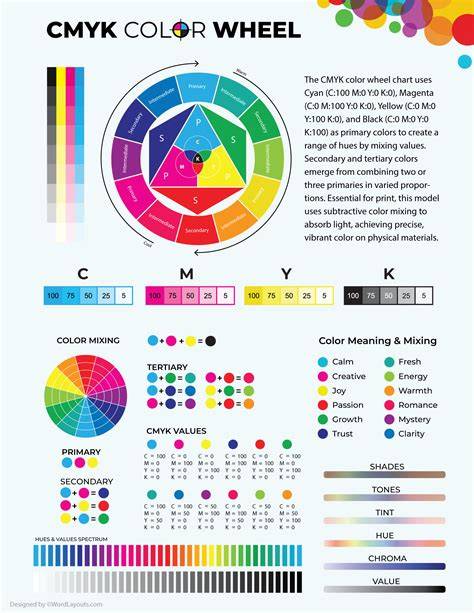
These four colors combine in different amounts to create the wide range of colors you see on a printed page. Black is essential in this process because it provides depth, contrast, and detail. Using “B” would cause confusion with Blue, which is often represented as “B” in other color models like RGB (Red, Green, Blue).
Why 'K' Stands for 'Key'
The simple answer is that K represents “key,” which literally unlocks the full potential of your print. In early offset and press printing, black ink was considered the “key” plate. This plate carried the detail and outline of the image, while the other colors were aligned (or “keyed”) to it. Black is represented by “K” because it’s the key color in printing.
The term CMYK has been used in the print industry for decades, but do you fully understand what it stands for? We all know that C is for Cyan, M is for Magenta, and Y is for Yellow, but have you ever wondered what the 'K' stands for? In modern printing, it refers to the color black-the key plate that adds detail and depth to a printed image.
#WisdomWednesday Ep. 28: CMYK origin story
Calibration, Accuracy, and Color Fidelity
Accuracy: If your black ink is calibrated accurately, all other colors-cyan, magenta, and yellow-will align perfectly. Calibration: In a process known as the GREACO standard, calibration sheets measure the accuracy of your black ink.
The power of proper calibration cannot be overstated. Without precise calibration, your prints could have undesirable color shifts, making them look yellowish, reddish, or bluish. This is why correct black separation and registration are critical to achieving consistent color reproduction.
Why Not B for Black?
One common question is: why does black toner or ink use the letter K instead of simply “B”? At first glance, “B” for black seems intuitive. However, using B can cause confusion with Blue, which is often represented as “B” in RGB models. The letter K also has roots in traditional printing methods, where the key plate carried the most detail and was used to align the other colors.
In traditional color separations, the Key Plate is the plate that holds the most detail in the image. The remaining plates (cyan, magenta, and yellow) are carefully keyed, or aligned, with the Key Plate. This process of aligning the color separation plates to the Key Plate is known as Registration. To assist in this process, every plate will have a set of registration marks on it that must be aligned perfectly.
- Always export or provide print files in CMYK if your project will be printed commercially.
- Understand that K adds depth, contrast, and detail, enabling richer neutrals and deeper blacks.
- Remember that Black (K) is a cost-effective ink choice and helps with color stability and readability on physical media.
- Ensure proper calibration and color management to avoid shifts when converting designs to CMYK.
CMYK printing remains a designer’s ally because it creates exceptional prints with depth and accurate color matches. The combination of Cyan, Magenta, Yellow, and Black makes it possible to reproduce a wide spectrum of colors even on physical media, something RGB cannot directly achieve for print workflows.
Practical Examples in Printing Projects
- Branding materials like business cards benefit from accurate CMYK matching to preserve brand colors.
- Professional brochures rely on deep blacks for contrast and legibility in body text.
- Stickers and packaging use CMYK to achieve vibrant hues while maintaining print reliability across printers.
Whether you’re a designer sending files to a commercial printer or printing in-house, understanding CMYK and the role of K helps ensure your final product matches your vision.