Figma is a collaborative design tool that helps designers create and maintain design systems. It offers a centralized environment where design assets, components, and guidelines can be developed, shared, and updated collaboratively. Figma streamlines the process of designing, prototyping, and ensuring design consistency across products and applications within an organization.
Design systems that scale: collaboration and reuse
Design systems enable adoption across teams by creating shared assets and libraries that the whole team can access. Design systems scale when teams collaborate on reusable assets to establish consistency and foster innovation across products. Publish assets in team libraries so the latest approved design elements are always a drag and drop away.
Standardize styles, variables, and components so that everything from color to padding scales seamlessly across your products and brands. Explore design system features to streamline the product development process with a system that’s aligned across design and code.
Implement design tokens with Figma
Use variables and modes to implement design tokens for your design system. Use color tokens to swap between light and dark modes, or typography tokens to change fonts between brands, and so much more. Get started with variables to map components in Figma to code and keep design systems in sync.
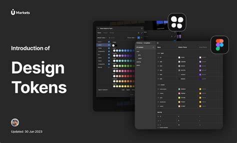
Use Figma’s variables REST API to create and manage variables in bulk-saving you time while scaling your design system. View documentation to understand the APIs and capabilities for managing tokens at scale.
Foundations: what a design system contains
A design system is a comprehensive collection of reusable components, guidelines, and tools that help teams build consistent, high-quality products. Think of it as a central toolkit for your product’s design, bringing your design and development work into a shared source of truth.
Design systems typically include UI kits, design tokens, patterns, and documentation. Tokens define values like colors, spacing, and typography, while patterns provide solutions for how elements behave. Documentation explains how and when to use each element.
Components of a design system can be understood through three layers:
- Design system-an overarching collection of resources, processes, and core principles guiding UX decisions and development.
- Component and pattern libraries-reusable UI elements, layouts, interaction patterns, and code snippets, backed by documentation.
- Foundational elements-the visual language, including color, typography, icons, logos, and accessibility and brand guidelines.
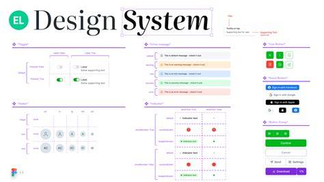
Component libraries contain the building blocks of a product, including individual components, layouts and templates, and interaction patterns. They bridge design and development by housing technical specs and code snippets that transform design intent into implementation reality.
Design systems and UX: myths, benefits, and the path to adoption
There’s a myth that design systems stifle aesthetics. In reality, they solve repeatable patterns, freeing designers to focus on new challenges and more intuitive experiences. With a design system maintained in Figma, designers can reuse consistent components, set up variants to switch between modes and screen sizes, and propagate updates from a single source of truth.
Why use a design system? It streamlines workflows, ensures consistency, and fosters cross-functional collaboration. A design system scales with your product and team, enabling faster time-to-market and a cohesive user experience.
For new designers, a design system can serve as an onboarding tool, educating them on principles and enabling earlier contribution. As the system matures, it provides a shared vision and language that enhances understanding and trust with users.

History and evolution of design systems
The idea of design systems has evolved from early pattern libraries and branding guidelines to comprehensive, code-friendly ecosystems. Influential milestones include NATO’s systems approach, Brad Frost’s atomic design, and later open-source frameworks like Google’s Material Design. Companies like Apple, IBM, Google, and Atlassian contributed to codifying design languages that emphasize documentation, accessibility, and reuse across products.
Today, design systems are living resources that reflect changing needs and technologies, enabling scaled cohorts of designers and developers to work from a shared vocabulary and components across devices and brands.
When to adopt a design system
One size does not fit all. Adoption should be driven by a strategic assessment of needs, including inconsistencies, themes across platforms, and the potential to accelerate development. For engineers, design systems provide predictable, documented patterns, reducing debates about UI and speeding implementation.
Consider factors such as diverse themes or platforms, repetitive design tasks, onboarding speed, and lifecycle efficiency. A well-implemented system helps teams communicate with a common language and centralize decisions, making onboarding faster and maintenance easier.
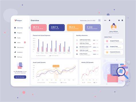
Design system adoption dashboard | May 2026
Practical path: from setup to scale in Figma
Starting with a design system in Figma involves standardizing styles, variables, and components so that every asset scales across products and brands. Use libraries to publish and share assets, and enable drag-and-drop reuse across teams. Map components to code to keep design and implementation in sync, and leverage Figma’s Dev Mode and tokens to accelerate the handoff from design to development.
Track usage analytics to understand adoption and impact. A case study from News UK notes a “night and day difference” after transitioning to Figma, with design system adoption acting as a catalyst for broader improvements.
Examples: standout design systems and how they inform your approach
There are numerous established design systems that illustrate different paths to success. Examples include Google’s Material Design 3, Shopify Polaris, IBM Carbon, Atlassian Design System, Uber’s Base, and Apple’s Human Interface Guidelines. Each demonstrates how a robust component library, accessibility considerations, documentation, and cross-team collaboration contribute to cohesive experiences across platforms.
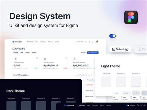
Other notable kits and templates range from TapTap Design System with extensive variables and Auto Layout support to community-created templates like Simple Design System and Finesse UI. These examples provide practical starting points for teams of varying sizes and needs.
Getting started with analytics and governance
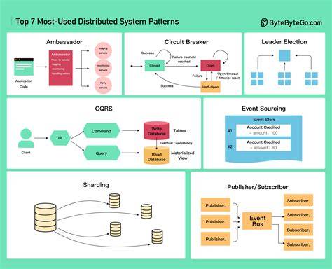
5 ways to maximize design system analytics help teams measure adoption, usage, and impact. Analytics provide the context needed to justify investments and guide iteration. Governance involves ongoing maintenance, cultural transformation, and champion communities to sustain adoption over time.
Ongoing maintenance is essential; a design system evolves with the product. Delayed gratification is real-benefits accrue over time, requiring patience and sustained leadership support. Resource allocation, cultural transformation, and broad onboarding strategies are critical for long-term success.
Next steps in your design systems journey
Implementing a design system brings consistency, scalability, and efficiency to product design. Whether starting from scratch or refining an existing system, studying successful examples can spark ideas, streamline decisions, and help you avoid common pitfalls. This guide highlights how to think about what a design system is, its benefits, and practical steps to apply in your own projects.
Design systems act as a shared toolkit of components, guidelines, and resources that help teams deliver cohesive user experiences faster. When combined with Figma’s capabilities, teams can standardize, scale, and accelerate design-to-code workflows while maintaining a living, collaborative design language.