One of the most amazing phenomena of the night sky is the aurora borealis (also known as the northern lights). For as long as humans have existed, the dancing, brilliant curtains of light have dazzled the viewers below. Advancements in digital cameras and photo editing software have created an incredible opportunity for you to edit your shots after a night out under the stars and lights. However, post-processing technology has, in my opinion, resulted in many aurora photographs that are over-processed to bring out a level of saturation and contrast that did not exist in the original scene. It is my goal when editing aurora shots to enhance but not over-enhance.
Understanding how each of the basic Lightroom editing tools impacts an aurora image can help you tell the story of a night out by making your file look like the sky did when you originally witnessed that beautiful light show. For the images above, I minimally edited the aurora and was careful not to over-enhance it. To illustrate how my favorite Lightroom sliders - Contrast, Clarity, Dehaze, Tint, Saturation, Vibrance, Shadows, and Highlights - affect an Aurora image, it is easiest to look at how extreme values for each setting impact the image.
Foundations of a strong aurora edit
- Contrast. Contrast is a very useful slider and a fundamental one for editing. By definition, the Contrast tool darkens the darkest midtones in the image and lightens the lightest midtones. In an aurora image, many darker midtones appear in the aurora itself. Pushing the contrast to +100 increased the saturation in the Aurora, and the foreground shadows became much deeper.
- Clarity. The Clarity slider adds contrast to the midtones without adding much noise. The tool is often used to bring out texture and details. As I said above, aurora colors generally fall into the midtones of your image, so a Clarity boost impacts them strongly. Boosting the Clarity to +100 adds definition to the banding of the sample aurora shot below because there are vertical dark lines in the sky. Adding +100 Clarity increases the banding in the aurora and makes the stars more visible.
- Dehaze. Similar to Clarity, the Dehaze slider increases midtone contrast and shadows to give the images a slightly darker and more saturated look. The Dehaze slider was built to remove haze from a scene. However, when you apply its technology to an aurora shot, it adds a lot of contrast and saturation to the image. In comparison to Clarity, the Dehaze slider adds a lot of contrast and saturation to the aurora image if it is boosted to +100.
- Saturation. The Saturation slider deepens, intensifies, and brightens the colors throughout the image. In an aurora photo, you’re often dealing with very intense colors, so you will find it is very, very easy to overdo the Saturation slider. Use Saturation sparingly.
- Vibrance. Vibrance is essentially a less aggressive version of saturation. It increases saturation selectively, with an emphasis on cooler rather than warmer tones. In aurora shots, the Vibrance slider provides a more realistic enhancement of the aurora’s colors. You can see in the examples below that there is still a real danger of going too far. You may find Vibrance to be great for natural aurora image editing. However, at -100, you can see a distinct difference from -100 Saturation.
- Shadows. The Shadows slider increases luminosity in the darkest parts of the image. With a picture of the aurora, you have a distinct advantage in that the Lightroom program interprets almost any part of the image that is not the aurora to be a shadow. The Shadows slider, therefore, lets you brighten or darken your foreground very easily. There is a very clear line - in an aurora image - between the highlights and the shadows.
- Highlights. The Highlights slider is the opposite of the Shadows slider and increases the luminosity of the brightest parts of the image. Lightroom interprets any part of the image with the aurora to be a highlight. That means an increase in the Highlights to +100 effectively increases the exposure of the aurora. There is a very clear delineation between shadows and highlights in an aurora image. Increasing the Highlights to +100 only impacts the brightness of the aurora.
- Tint. The Tint slider is meant to be used for color correction in correspondence with the Temp slider. When editing your northern lights photos, you can use the Tint slider to neutralize the snow, which tends to turn green during intense aurora displays. A Graduated Filter with increased pink tints and decreased saturation can help make the snow look closer to white.
Now that you know how each slider impacts your overall image, it’s time to combine each in moderation to achieve a final edit. For the shot below, I wanted to make sure the banding in the aurora was enhanced along with the purples. Now I want you to experiment with editing aurora images! Please pick your favorite aurora photo, then do some post-processing based on the advice I’ve shared. Then share the results in the comments below!
Practical workflow and settings
Ian Johnson is a photographer, scientist, writer, wildlife biologist, musician, and woodworker located in Hoonah, Alaska. Described as a Renaissance Man, he lives and breathes the challenges and opportunities that life in rural Alaska can present. You can find him subsisting-in and photographing Alaska simultaneously. He’ll remind you: the northern lights are an incredible display of the strength and beauty of nature.
As a light source themselves, caused by the colliding of plasma ejected from the sun hitting particles in our upper atmosphere, we don’t need a lot of it to get a great photo. The thing about the aurora borealis is that when we shoot it, we can treat it similarly to a waterfall, in that it’s constantly moving and so we can use a relatively long exposure to smooth out the motion, or a relatively short exposure to capture the detail of the light. Before we get into the retouching, as a baseline for our camera settings, we should use a high ISO to capture the light. In the darkness that accompanies the aurora, the effects of camera noise are minimal. We usually need the widest aperture we can choose, which for me is usually f/2.8.
For this tutorial, I’ve provided one of my RAW files from Iceland, shot in September 2019, which you may use freely for educational and practice purposes. Postprocessing our aurora images can be a tricky thing because these aren’t necessarily images we’re used to seeing or retouching. This can also give us more room for creativity, in that the realism conveyed in the image is much more flexible for the same reason.
Color management and color realism
First off, let’s open the image in Adobe Camera Raw. When retouching aurora images, the place to start is with the white balance, so let’s go over that. The reality of the northern lights is that the white balance we apply is determined by the resultant color of the sky and the foreground. The aurora itself can range in color from greens through reds and purples, so that element of creative control comes into play. In general, the aurora tends to be green with fringes of purple, and a color temperature of 4000K will reflect this true color quite well, while maintaining an accurate night sky.
First, slide both the Vibrance and Saturation sliders all the way to 100. With these settings applied, and knowing that we can see all the colors present to assist us in our decisions, let’s go ahead and adjust the white balance. Using the Temperature and Tint sliders, we can make the adjustments to the aurora, ensuring the accuracy of the color and tone. We can create a deep green aurora, or something with a feel of mint, so long as we keep within the limitations of realism, while maintaining a foreground and night sky that are convincing.
Now that we have the color we want, it’s time to make some adjustments to the brightness, but rather than using the Basic panel sliders, we’ll use a Curves adjustment. In the Tone Curve panel, we’ll make our adjustments on the Point tab. The graph we see for an aurora image will generally show that there are peaks in the shadows, dropping off toward the midtones and fading away altogether in the highlights. As a matter of preference, I like to start by raising the black point slightly to give a slightly “lifted-black” look. To do this, we need to grab the bottom-left point of the curve and drag it up very slightly, resulting in an Input value of 0 and an Output value of 10 (displayed below the chart).
Next up, let’s go across the rest of the curve adjustment and give a little more power to the light within the scene. Looking at where the chart peaks-so we know where the light actually is within the scene, as represented on a graph-we can select areas where we wish to raise the highlights by simply clicking-and-dragging on our linear curve. It’s worth noting that we’ll apply these adjustments across the spectrum of the image, but we can choose to target the tonality of specific colors within RGB by making the appropriate selection in the Channel menu. The adjustments made here bring a slight elevation to the curve.
Next on the agenda as we process our northern lights image is to address any noise issues as a result of shooting at a high ISO, and any sharpness issues caused by finding focus in the dark. If we simply grab the Sharpening Amount slider, we’ll lose some quality (and this is a bit too much to elaborate on in a short tutorial), but one trick I use to maintain the quality while enhancing the sharpness is to apply an adjustment that restores some of the sharpness we inherently lose when shooting in RAW format. First, concentrating on the Sharpening section in the Detail panel, drag the Radius slider all the way to the left to its lowest value of 0.5, and drag the Detail slider all the way to the right to its maximum value of 100.
TheAdjustments for lens imperfections are important with aurora shots, where flaws can stand out. A simple way to address these universally and at the same time is to deal with the darker corners and any halos around stars. This is done in the Lens Corrections panel by checking Remove Chromatic Aberration and Enable Profile Corrections. In the Basic panel, use the Clarity slider to add a little extra definition to the stars by shifting the slider to the right (to +20). A final creative step can be using the Adjustment Brush to add a subtle ethereal glow to some stars with a gentle exposure boost (+0.50) at a small brush size.
We can apply final global adjustments to add the finishing touches. We’ve already applied a little contrast with the Curves adjustment, but we can tweak the Contrast in the Basic panel if it helps the image. The HSL Adjustments panel can help when there’s a strong green color; use Greens to adjust luminance and saturation for a more realistic result. Auroras often invite experimentation, but moderation remains key to avoid an artificial look.
Seeing and shooting the northern lights is high up on many bucket lists, and I hope this tutorial has been great fun. Aurora files need careful white balance and brightness before noise, sharpness, and restrained color can support a believable sky. Aurora Borealis or the Northern Lights are a stunning subject that piqued the general public and photographers’ interest, especially over the last few years. Chasing Aurora may even become a bit of an addiction for some. People will often ask if my images are accurate, if the photos were edited a great deal, or if they could see exactly that with their eyes. I’ve pulled some examples to show aurora before and after editing to illustrate the differences.
Practical photography reminders
- Cameras allow us to capture the night sky in a way that our eyes are not capable of seeing. Aurora borealis is just one example of something we can see, but the scene our eyes pick up is not the result that the camera records.
- Human eyes have two types of receptor cells; rods and cones. Cones are responsible for colour vision and function best when there is a lot of light; rods are used at night. Each person may be able to detect and see the aurora differently.
- When learning how to edit aurora photos, the Basic Panel in Lightroom Classic is your starting point for revealing the aurora’s true beauty. The HSL panel is indispensable for tuning specific hues without overdoing saturation. Shoot and edit in RAW for maximum flexibility.
- Local adjustments and selective masking are powerful for refining foreground details without compromising the sky. Preserve natural colors and avoid an overly cartoonish look by moderating vibrance and saturation.
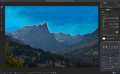
How to Edit The Northern Light Images in Lightroom
Quick reference: essential steps in order
- Shoot RAW with a sturdy tripod and wide-angle lens; use a wide aperture (f/2.8 or wider) and experiment with exposure times.
- Import into Lightroom Classic; apply Lens Corrections (Profile Corrections, Remove Chromatic Aberration).
- Set white balance using Temperature and Tint; raise Vibrance and Saturation to assess color presence.
- Adjust Tone Curve for subtle brightness separation and lift shadows/highlights; refine with Curves and the Basic panel.
- Control color with HSL, focusing on greens and purples; reduce over-saturation to maintain realism.
- Manage noise with luminance and color noise reductions; use Masking during sharpening to protect smooth areas.
- Apply selective adjustments to enhance stars and aurora separately; consider radial or graduated filters for sky foreground balance.
- Review and refine for harmony between color, contrast, and detail; avoid over-processing and maintain natural look.
Seeing, shooting, and post-processing the aurora is a blend of science, technique, and artistry. The goal is to convey the magic you witnessed, not just to replicate a dramatic color palette. With practice, your aurora edits can strike a balance between realism and beauty, letting viewers feel the night as you experienced it.