Even a perfectly exposed photograph straight from a camera rarely looks how your eye remembers the scene. Camera sensors have a different spectral response to human vision. Automatic white balance algorithms introduce casts under mixed lighting. Indoor artificial light pushes colours toward orange or green. Shade in daylight renders everything blue. Beyond technical correction, there is also creative colour grading: the deliberate push of tones toward a mood. Warm golden highlights suggest late afternoon. Cool desaturated shadows read as cinematic and dramatic. Muted mid-tones with lifted shadows create a film emulation look.
The tools available in GIMP 3.x for colour work include Curves, Levels, Hue-Saturation, Color Balance, Brightness-Contrast, Exposure, Colorize, Desaturate, and Posterize. Of these, Curves is by far the most powerful and the one professional retouchers reach for first. Levels is faster for simple tonal adjustments. Best practice: Before doing any colour work, duplicate the original layer (Shift+Ctrl+D) and lock it at the bottom of the Layers panel. Apply all corrections to the duplicate.
Reading the histogram and preparing for correction
The histogram is a bar chart that shows the distribution of pixel brightness values across your image. The horizontal axis runs from pure black (0) on the left to pure white (255) on the right. The vertical axis shows how many pixels have each brightness value. Dark areas: deepest blacks, deep shadow detail. Most of the visible detail in a properly exposed image lives here. Skin, foliage, mid-grey objects. Bright areas: specular highlights, sky, white fabric. In GIMP, the histogram is visible in Windows → Dockable Dialogs → Histogram. You can view a combined luminosity histogram, or switch the channel dropdown to Red, Green, or Blue individually.
Levels: quick tonal corrections and color cast fixes
Levels is the fastest and most intuitive tonal correction tool in GIMP. It works by letting you set the darkest point, the brightest point, and the midtone gamma of an image. Black point (left triangle): Drag right to set which input level maps to pure black. Any pixel darker than this point becomes solid black. Gamma / midtone (middle triangle): Drag left to brighten midtones, right to darken them, without affecting the black or white points. White point (right triangle): Drag left to set which input level maps to pure white. Below the input sliders is a second, simpler gradient bar with two sliders. The left output slider raises the minimum output level - So instead of mapping to pure black, the darkest pixels map to a mid-grey. This is used deliberately to create a faded or matte film look. The right output slider lowers the maximum - Instead of mapping to pure white, the brightest pixels become slightly off-white. Switch the Channel dropdown from "Value" to Red, Green, or Blue to adjust levels for individual channels. This is how you fix colour casts in Levels: if the image has a warm orange cast from tungsten lighting, reduce the Red channel's white point slightly and raise the Blue channel's white point. Auto Levels shortcut: Click the "Auto" button in the Levels dialog to let GIMP automatically stretch each channel's histogram to fill the full range.
Curves: the most powerful colour correction tool
Curves is the most powerful colour correction tool in GIMP and the one that professional retouchers use for almost every tonal or colour adjustment. The most commonly applied curves adjustment is the S-curve, which adds contrast and "punch" to a flat image. Open Colors → Curves. Click on the curve roughly one-third from the top (highlight area) and drag it slightly upward. Click on the curve roughly one-third from the bottom (shadow area) and drag it slightly downward. The curve now forms a gentle "S" shape. For portraits, keep the S-curve gentle - A strong S-curve crushes shadow detail and blows highlights. Switch the Channel dropdown to Red, Green, or Blue to adjust the tone curve for a single channel. Green cast: Pull the Green channel down. Sampling with the colour picker while Curves is open: In GIMP 3.x, you can click directly on the image while the Curves dialog is open to sample a colour. The corresponding tonal position on the curve is highlighted.
Hue-Saturation and per-channel adjustments
The Hue-Saturation dialog is the primary tool for changing specific colours without affecting others. Its power lies in the "All" dropdown: switch it from "All" to a specific colour (Red, Yellow, Green, Cyan, Blue, or Magenta) and any adjustments you make affect only pixels of that approximate hue. Creative per-colour trick: Switch to the Blue channel and reduce Saturation to -30 while leaving all other channels at 0. This gives skies a slightly muted, film-like quality while keeping green grass and warm skin tones fully saturated.
Color Balance and tonal grading
Color Balance provides three sliders operating on complementary colour pairs: Cyan-Red, Magenta-Green, and Yellow-Blue. This tool is particularly useful for creative colour grading, because it gives you a very direct way to say "push the shadows toward teal and the highlights toward warm orange" - A classic cinematic contrast grade. Drag Shadows toward Cyan and Blue, then drag Highlights toward Yellow and Red. Unlike Curves, the Color Balance tool does not offer per-channel histogram control, and it cannot target midtones as precisely. The "teal and orange" grade: Enable "Preserve Luminosity" at the bottom of the Color Balance dialog. Then: Shadows: Cyan +20, Blue +15. Highlights: Red +15, Yellow +10. Midtones: Magenta -5, Yellow +5.
Brightness-Contrast and practical workflow notes
Colors → Brightness-Contrast provides two sliders: Brightness (global lightening or darkening) and Contrast (expanding or compressing the tonal range). The Brightness slider in its legacy mode simply adds or subtracts the same value from every pixel. This compresses the dynamic range: increasing brightness pushes highlights toward blown white; decreasing it crushes shadows to pure black. Even so, Curves gives you far more control for the same result. A simple midtone lift in Curves (pulling the centre of the curve upward) increases brightness while protecting highlights far better than the Brightness slider. Use Brightness-Contrast only for very quick exploratory adjustments or when you need to explain a concept to a beginner.
White balance and neutral references
White balance is the process of ensuring that neutral colours (white, grey, black) in an image appear neutral rather than tinted. The most reliable way to fix white balance in GIMP is using Curves on individual channels, guided by a known neutral reference in the image - A white piece of paper, a grey card, a white wall, or a white shirt. Identify a neutral reference: Find an area in the photo that should be pure white or neutral grey. Open Curves: Colors → Curves. For a white reference, all three channels should read 255. Adjust each channel to match: Switch to the Red channel. If the sampled R value was 240 and should be 255, pull the top-right anchor of the Red curve slightly to the left (to the 240 input position) so that 240 maps to 255. Fine-tune visually: Switch back to the All (Value) channel and look at the image.
Skin tones and neutralization strategies
Skin tones are one of the most difficult things to colour-correct because the human eye is extremely sensitive to them. A slight blue cast on a wall is barely noticed; a slight blue cast on a person's face reads immediately as "sickly". Healthy skin tones Across all ethnicities share certain characteristics: they contain significantly more red than blue, and typically more red than green as well. The exact values vary enormously by skin tone, but the ratio (R > G > B) is nearly universal. A useful target for neutral Caucasian skin in midtone: approximately R 210, G 165, B 140. Sample skin midtones: Use the Colour Picker (O) to click on the cheek or forehead - A midtone skin area away from shadows or specular highlights. Check the ratios: Is R significantly higher than B? If B is approaching R or exceeding it, there is a cool/blue cast on the skin. Correct with Curves per channel: Open Colors → Curves. Make a small midtone lift on the Red channel if skin looks cold. Reduce the Blue channel midtones slightly if there is a blue cast. Use Hue-Saturation for final cleanup: Switch to the Red channel in Hue-Saturation. A Saturation of -5 to -10 softens ruddy or overly saturated skin.
Practical tips and scripting
GIMP's Script-Fu console (Filters → Script-Fu → Console) lets you record and replay any sequence of colour adjustments as a script. In GIMP 3.x, every action you perform is recorded in the Edit History. You can access this via Edit → History. This wikiHow teaches you how to change the color of any part of a picture in GIMP, using a computer. GIMP is a free, open-source graphics editor available for desktop systems. To recolor something using GIMP, create a transparent layer. Use the lasso tool to select the image you want to recolor, and then fill in the selection with the bucket tool. Launch GIMP on your computer and click the File button. Select Open, and then select the image you want to recover. Click Layer in the top menu bar. Select New Layer. In the Create a New Layer pop-up, select Transparency next to Fill with. This button looks like a lasso icon in the toolkit section on the top-left. Each mode will change the color slightly. You can select Burn, Multiply, Darken only, and more. Launch GIMP on your computer and click the File button. Select Open, and then select the image you want to recover. Click Layer in the top menu bar. Select New Layer. In the Create a New Layer pop-up, select Transparency next to Fill with. Make sure the new, transparent layer you created for the paintbrush process is selected on the Layers list. This option is at the bottom of the dialog box. This button is on the bottom-right corner of the dialog box.
Filters and practical application
Filters are pre-designed effects with some editable data that helps in image manipulation and image editing work of GIMP. We have several filters in GIMP, which has different effects and uses for different purposes. We have Drop shadow filter, Long shadow filters, New Print filters, and many more, which we will discuss in this article. You will find filters in the Filter menu of the menu bar. There are many Filters in the list Filter menu, and each filter of the list has several filter effects. So for that, first of all, let us create a new document or new image for this purpose. Now go to the Filter menu of the menu bar and click on it. And type your desired text here on the document area. I will type EDUCBA, which is our official name. You can also change the color of shadow by changing the color of the Color box of this dialog box. Now let us apply one filter to any image. Then choose your desired image from this dialog box. I will delete the background of this image like this. Now click on the Create a new layer button of the layers panel for having a new layer. I have a layer with a Foreground color fill. You can have any color for your layer according to your image object. Now again, go to the Light & Shadow filter of Filter menu and choose Long Shadow filter of new scroll down list of Light & Shadow filter. You can choose any one of the options from the list of Composition option of this dialog box. If you choose the ‘Shadow minus image’ option, then it will delete the main image, and the shadow will remain like this. Now let us understand one more filter, which is Distorts. Once you apply this filter to your image, it will give you a newspaper print effect on your image. Then it will have this type of effect. Here we discussed some of the important filters of gimp, and now you can have good knowledge about what filters are. This is a guide to GIMP Filters. Here we discuss the important filters of gimp, and now you can have good knowledge about what filters are?.
Practical recoloring workflow
Adding color to an image is as easy as a couple of clicks. Before you add color to your image, you need to select a color. You will now see a color picker. Click in any of the color areas to select a color. Alternatively, use the large square at the left. This is the Gimp Color Selector. In our screenshot, the Gimp Color Selector is filled with reds that fade to black and white. If we wanted to select say, green, we would first click the color strip to the right. Doing this would automatically fill the Gimp Color Selector with green. You can also use the tabs at the top of the large square to change colors. These represent different modes of color selection. When using watercolor mode to choose your colors, you can click in the large square multiple times. If you want to select a color that's already on your image, you can use the eyedropper tool (from the main toolbox). With the eyedropper tool selected, simply click anywhere in the image. There are different ways of applying color to your image. The paintbucket allows you to apply color to a large area of your image. Now click on your image in the area you wish to apply the color to. Whenever you use a drawing or paint tool, the color is automatically set at the current foreground color (i.e. the selected color from the color area). I did this using the airbrush tool and selecting a darker shade of red.
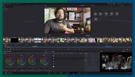
Colour Grade Images with Gimp | How to use Gimp for Photo Editing
These elements together form a practical workflow for color work in GIMP: assess lighting, select a baseline correction path (Levels, Curves), apply global adjustments, refine with per-channel tools (Hue-Saturation, Color Balance), and finish with localized tweaks and scripting for repeatable processes.