Halftone gradients offer a playful, retro texture that can elevate any design. This article compiles step-by-step techniques to create and refine halftone effects in Illustrator, combining rasterized processes with vector tracing for scalable results.
Foundational steps: creating a black-and-white gradient and converting to halftone
Step 1: Create a rectangle with a black and white gradient. You may want to add another black stop/point to extend the dark area.
Step 2: Apply Effect -> Pixelate -> Color Halftone (you may want to increase the maximum radius (dot size) to create accurate circle dots later).
Step 3: If you forgot to increase the dot size. Ensure that you increase the resolution in the Effect -> Document Raster Effect Settings.
Step 4: Expand Appearance (Object Menu -> Expand Appearance).
Step 5: Image Trace (Object Menu -> Image Trace -> Make). Don't forget to show the Image Trace Panel for the fine-tuning of the settings (Window menu -> Image Trace).
Step 6: Once you're satisfied with the trace, Expand (Object Menu -> Expand).
Step 7: Ungroup twice (Object menu -> Ungroup or Ctrl+Shift+G).
Step 8: Make Compound Path (Object menu -> Compound Path -> Make).
Step 9: Apply a gradient to the compound path (you won't achieve the gradient unless you make a compound path).
Step 10: Create a rectangle with your background color, and Send to back.
Why halftones work and where they shine
Halftones are widely used in screen and offset printing, where the dot pattern mimics the way colors are built up in CMYK printing. They’re perfect for creating bold stencil designs, adding texture to digital art, or even producing those transparent effects often seen in modern design. Whether you're aiming for sharp contrast or subtle gradients, halftone patterns allow for a versatile way to experiment with textures and effects that can elevate any design.
From posters to T-shirts to digital illustrations, halftones work across a variety of art styles and is a must-know technique for any creative.
Native Color Halftone: controlling dot size, angles, and rasterization
Native Color Halftone: Create or select the object you want to apply the halftone effect to. The Color Halftone dialog box will pop up, giving you options to adjust the settings:
- Max. Radius: This controls the size of the halftone dots. Larger values create bigger dots, while smaller values make finer dots.
- Screen Angles: The angles at which the halftone screens will be applied. You can set different angles for each of the four color channels: Cyan, Magenta, Yellow, and Black (CMYK).
For a single-channel halftone (e.g., Color Halftone), Illustrator won’t preview the changes, so you need to click OK to confirm. If you want to make further edits, open the Appearance panel (Window > Appearance), with your object still selected. You will then see Color Halftone listed.
Tips: To get a more dynamic halftone effect, you can experiment with applying a black and white gradient to your object first. With this approach, the dots will scale according to the tone of the object. You can then edit the Gradient to further adjust dot placement.
Rasterizing and refining halftones: resolution and trace considerations
Rasterize the Halftone Effect: As with all raster-based live Effects, the resultant resolutions are determined by the Document Raster Effect Settings dialog (Effect > Document Raster Effect Settings...). The default resolution depends on the template: 72 ppi for screen-based and 300 ppi for print-based templates.
If you wish to rasterize a single object with the native halftone effect applied, ensure it's still selected and then choose Object > Expand Appearance. For grouped selections that include the halftone effect, ensure the Document Raster Effect Settings are set to the desired resolution (dpi) before proceeding. In the Rasterize dialog box, set Resolution to something like 300 ppi for print work.
In the Image Trace panel, set the mode to Black and White (if not already). Under Advanced, enable Ignore White and use Preview to see the trace in real time.
Alternative vector halftones: using Phantasm and live trace
Creating vector halftones quickly using Phantasm: If you have the Phantasm plugin installed, you can add halftone shading to vector artwork with a flexible set of controls. Type: Monochrome, RGB/CMYK, or Sampled color. Pattern: Regular or Alternating grid, FM or Radial. DPI controls density; Angle sets the pattern orientation. Clip to Object crops halftone to the path geometry. Dot Properties adjusts scale, shape, and tint for final tweaks.
Once happy with the halftone, you can adjust it later by reopening the Phantasm dialog from Window > Astute Graphics > Phantasm.
Creative strategies: gradient-based halftones and trace-based approaches
One approach is to create a greyscale gradient instead of pure black, apply Color Halftone, then Expand and Group. This yields halftone dots that respond to tonal variation, allowing smooth transitions. Since the halftone is a grouped set of fills, you can scale and transform it freely. You can also replace the default dot fills with a custom shape by drawing your replacement shape, then using it in place of the dots to achieve a unique texture.
Another common workflow is to convert a gradient rectangle into a checkered halftone pattern, expand, then Live Trace to convert the bitmap pattern into vector shapes. By tweaking Trace options-Black and White mode, Threshold, Blur, and ignoring White-you create a clean vector halftone that can be recolored or gradient-filled for richer results.
Practical tips for achieving varied halftone effects
- Experiment with different dot shapes (circles, stars, custom icons) to replace standard circular dots for a distinctive look.
- Combine halftone layers with clipping masks, gradients, and vector shapes to create depth and texture.
- Use gradients behind the halftone to influence dot placement and tone across a design, achieving dynamic variations.
- Consider the intended print or display resolution; align Document Raster Effect Settings with final output to preserve quality.
Case applications: where halftones shine
- Bold poster typography with high-contrast halftone accents.
- Retro-inspired apparel designs featuring circular dot fields or fading halftone edges.
- Digital illustrations that require scalable textures without raster degradation.
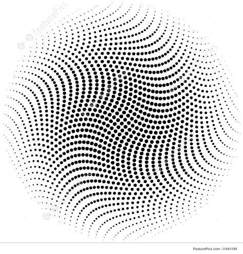
How To Make Halftone Dots With Adobe Illustrator || Adobe Illustrator Tutorial 2026
These techniques provide a versatile toolkit for adding halftones to any project. With Illustrator, you can create multiple halftone styles-from classic circular grids to fading and gradient-driven patterns-while preserving vector scalability and crisp edges.
tags: #halftone #gradient #illustrator