The core insight for effective Midjourney prompts is to lock the palette first and keep the model’s stylization low, so color dominates the result rather than lighting or gradients. Build a swatch: 800×800px, 3-6 equal squares on a white background, then attach the swatch before the prompt in Discord to guide the AI reliably. Generate 4 variations, pick the closest, request variations on that one, then upscale; after 1-3 iterations with a swatch and hex codes, you can achieve high adherence to the intended colors. Day by day, finalize 3-6 hex colors and apply them to different asset types such as poster, product, or social tile. This approach helps separate color decision-making from styling decisions and reduces unwanted color shifts caused by lighting or gradients.
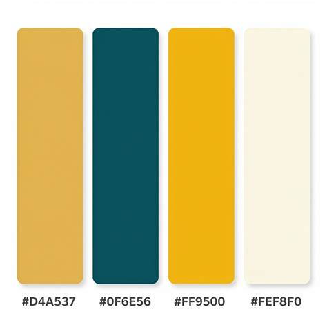
Visualizing the palette: the swatch and hex discipline
Day 1 focuses on finalizing 3-6 hex colors. Day 2 uses the poster prompt with 4 variations to establish how the color set behaves in a strong, high-visibility format. Day 3 runs the product prompt, testing color fidelity on more constrained shapes and surfaces. Day 4 creates a social tile, where legibility and color impact collide with smaller formats. Throughout, paste the 3-6 hex codes and indicate the asset type you care about most to keep the workflow transparent and reproducible. In practice, Midjourney prompts won’t accept direct HEX inputs as operational color pins, but you can shape the palette in early iterations and then enforce it visually through descriptive color terms and careful prompt construction.
Strategies for color-centric prompts
Prompt structure matters: emphasize explicit color language and reduce reliance on stylistic adjectives that pull color toward lighting shifts. The article notes that Midjourney does not understand explicit color codes like HEX; color names are the primary lever, but they’re not standardized across tools. Therefore, create a swatch first and then guide the model with color descriptors that align with the swatch beads. Use color-related terms that stay descriptive rather than interpretive about the scene’s lighting or gradient. The goal is to increase the palette’s weight relative to stylistic words while keeping stylization relatively low to prevent unpredictable color shifts.
Color taxonomy and practical prompts
Bright families such as Warm Tones (reds, oranges, yellows) and Earth Tones (browns, greens, tans) set grounded, organic vibes, while Pastel Tones soften the atmosphere. Neutral Tones add subtle sophistication, and Monochromatic schemes rely on varying shades of a single hue for unity. Muted Tones can evoke vintage looks, and Vibrant Tones push for pop in posters or social tiles. When expanding the basic color set, be mindful of words that can double as objects; using the -color suffix is a practical workaround to emphasize color over noun that could confuse the bot.
Legacy color keywords, though partially superseded, still inform practical prompts. A mix of basic colors (white, black, red, blue, green, yellow, etc.) works reliably in newer Midjourney versions, but some terms like fuchsia or violet can be unreliable due to potential object associations. When introducing newer basic colors (gold, silver, bronze, cream, navy, lavender, peach, coral, mint, mustard), ensure they modify an object in a way that remains unmistakably color-related-e.g., “silver-color ball” instead of “a silver ball.”
To expand color precision without misinterpretation, prefer adjectives that tie color to the material or surface, e.g., “azure fabric,” “chartreuse leaf,” or “mustard tile.” This reduces ambiguity and helps Midjourney adhere to the intended palette. The “color wheel” concept from articles is often not practical as a direct reference in prompts; rely on concrete color descriptors and the swatch to anchor your results.
Swatch construction and workflow integration
Construct a swatch 800×800 pixels with 3-6 equal squares on a white background. In Discord, start the prompt and attach the swatch first to establish the visual color framework. Then proceed with the variations, selecting the closest option for subsequent iterations, and finally upscale. After integrating 1-3 rounds with the swatch and your 3-6 hex values, you achieve higher adherence to the intended palette. This discipline reduces the tendency of Midjourney to “improve” color with lighting and gradients and keeps the palette front and center.
Operational steps by asset type
Day 1: Finalize 3-6 hex colors. Day 2: Run the poster prompt (4 variations) to evaluate legibility and impact. Day 3: Run the product prompt to test color behavior on surfaces and materials. Day 4: Run the social tile to assess how the palette translates to a compact, online-ready format. Throughout, paste the 3-6 hex codes and indicate the asset type you care about most to maintain focus and reproducibility.
Notes on color theory and practical prompts
This article experiments in prompting color with reference to color theory, highlighting that word choices in prompts may carry multiple meanings and associations. Midjourney’s internal color vocabulary evolves across versions, making explicit color control challenging. The key takeaway is to visually lock the palette early, then state it plainly, and weight the palette above stylistic descriptors to maximize color fidelity across variations and iterations.
- Create a 800×800 swatch with 3-6 equal squares on a white background.
- Attach the swatch first in Discord, then start the prompt.
- Generate 4 variations, pick the closest, request variations, then upscale.
- Repeat 1-3 times with the swatch and hex codes for high adherence.
- Finalize 3-6 hex colors on Day 1, then use them for poster, product, or social tile prompts on subsequent days.
Additionally, consider practical prompts that minimize ambiguity, such as “blue-gray surface with chrome accents” or “mustard tile with ivory grout,” to anchor color in recognizable materials and contexts. If you need a color reference, rely on the legacy color keyword ideas and test them - some terms work well when they modify an object (e.g., “silver-color ball”) but can create confusion when they stand alone or denote a plant or noun (e.g., “lavender ball”).
Seedance 2.5 Tutorial: How to Make AI Videos With Seedance in 2026
In summary, the color-first approach in Midjourney hinges on locking the palette visually, then stating it unambiguously, and finally guiding the model with deliberate prompt wording that emphasizes color over lighting or gradients. This method provides predictable color outcomes across posters, products, and social tiles, while preserving stylistic control at a reasonable level.
tags: #midjourney #color #prompts