Blue is one of the three primary colors within the RGB color model and can be created by combining cyan and magenta within the CMYK color model.
Blue is associated with feelings of calmness and tranquility, reflecting the appearance of the sky and large bodies of water. Designers can utilize blue’s many hues and cool tones to evoke a wide variety of emotions, from serenity to melancholy.
Color definitions and digital specifications
Blue is defined by the following color codes and values to ensure consistency across various digital platforms and devices. HEX code: #0000FF; RGB value: 0% red, 0% green, and 100% blue. In CMYK, blue is often represented as a high cyan and magenta blend with little to no yellow or black, though exact conversions can vary by device.
The CMYK system is the backbone of the color printing technology found in both large industrial and small desktop printers. Please understand that the hex code of the blue CMYK mentioned on this page is only an approximation. View the detailed color specifications of Blue CMYK, including Hex, RGB, CMYK, HSV, HSB, Pantone and RAL codes.
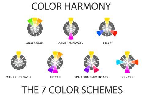
Blue CMYK comes alive through a spectrum of shades, tints, and tones, each offering a variation of this regal color. Explore the versatile Blue CMYK color palettes, including Complementary, Analogous, Split-Complementary, Triadic, Tetradic, and Square schemes.
Color harmonies, variations, and palettes
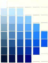
Shades, Tints, Tones, and Hues: blue offers a broad range of variations to suit different design intents. Complementary colors such as orange can make blue pop, while neutral tones like white or gray help the blue color stand out with greater impact.
Complementary examples include Beige (#EDE8D0) for warm contrast, Navy blue (#000080) for depth, Peach (#FFD3AC) for warmth, Yellow (#FFFF00) to inject vibrancy, and Silver (#C4C4C4) for an elegant accent. Other noteworthy considerations include lavender for depth and mustard for a subtler, less vibrant contrast.
Be mindful that color meaning can shift across cultures and contexts. If designing for a global audience, research color considerations for specific regions.
Blue variations for professional and calming applications
Slate blue (#5B7C99) offers an understated professional option with a muted, gray-blue hue, while Powder blue (#B6D0E2) provides a delicate, calming feel. Cerulean (#2A52BE) sits between vibrant and reserved, suitable for business use cases. Turquoise (#40E0D0) leans toward green but maintains blue’s relaxing vibe. Utilizing neutral tones can help blue stand out more prominently in layouts.
For a pop of contrast, consider complementary accents such as orange; for warmer balance, Beige, Peach, and Gold tones can complement blue without overwhelming it.
Practical design guidance and cultural notes
Blue communicates trust, stability, and professionalism, making it a common choice for corporate branding, banks, and enterprise software. It also promotes calm and focus in work environments and during user experiences, such as in hospital or office settings.
Blue’s cultural meanings vary: ancient Greeks linked it with gods and heavens, while Indigenous communities in some regions see it as a symbol of wisdom, spirituality, and healing. The sky and ocean associations help connect blue to feelings of safety and reliability in professional contexts.
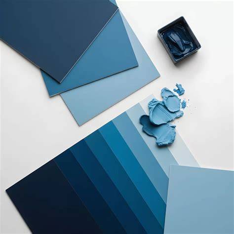
In practice, designers use blue to establish visual hierarchy by employing light-to-dark blue variations for buttons, headers, and emphasis items. Considerations for accessibility include ensuring sufficient contrast and color independence where possible, with tools like Figma plugins helping meet Web Content Accessibility Guidelines.
Color Theory for UX/UI Designers: Everything You Need to Know
CMYK specifics and practical printing considerations
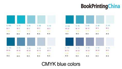
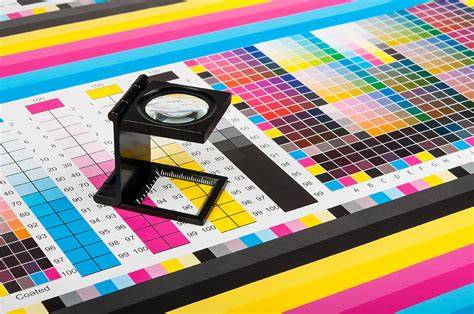
In CMYK, blue is one of the more challenging colors to reproduce accurately. For balanced results, even mixtures such as 100-50-0-0 (cyan-magenta-yellow-black) are recommended as starting points, while exact hues depend on press conditions and material.
CMYK printing cannot perfectly replicate all blues; the hex code #0000FF is the digital representation and serves as a reference point rather than a guaranteed print match. Designers should be prepared to swatch and calibrate between on-screen colors and printed outputs.
When discussing related blue tones, it’s helpful to consider related hues such as Dark blue, Blue gray, and Blue green to guide palette selection for different branding needs or UI contexts.
Historical and technical context
The color blue derives its name from the Old French word “bleu,” linked to the Proto-Indo-European root bhel meaning “to shine.” The ancient Egyptians used blue pigments widely, including the famous Egyptian blue pigment, which influenced later pigment development. In the West, blue’s association with royalty grew during the Middle Ages and Renaissance due to its rarity and cost. The Industrial Revolution brought synthetic blue pigments, expanding accessibility.
Understanding blue’s journey from ancient minerals to modern digital standards helps designers appreciate its versatility and limitations across media.
Summary of key values and practical takeaway
Blue is a versatile, calming color that conveys trust and professionalism. In CMYK printing, achieving precise blue requires careful balancing of cyan and magenta, with yellow and black tuned to impact readability and vibrancy. On-screen blue (HEX #0000FF) and print blue can diverge; always test across devices and materials. Use lighter blues to highlight elements and darker blues for depth, ensuring accessible contrast for all users.
| Context | Blue representation | Notes |
|---|---|---|
| Digital | HEX #0000FF, RGB 0-0-255 | Pure blue on screen |
| CMYK around 100-50-0-0 (starting point) | Calibration required | |
| Complementary | Orange tones | Creates pop and contrast |