Effective CMYK screen printing is an art that understands the magic of four colors: Cyan, Magenta, Yellow, and Black. The key lies in the skillful layering of these colors using halftone dots, a method that allows us to create a rainbow spectrum on any material. But here's a twist: each color needs its own screen, making color separation the linchpin to vivid and accurate final prints. With precision and expertise, Extreme Screen Prints has paved its path in this colorful world.
Basics of CMYK Screen Printing
CMYK screen printing involves a remarkable process that utilizes four primary colors-cyan, magenta, yellow, and black-to reproduce a diverse range of colors for intricate designs on various materials. Each ink layer is applied using halftone dots, which blend together to produce an extensive spectrum of hues and shades, enabling the creation of stunning and vivid color combinations.
The key to mastering CMYK screen printing lies in understanding how these four colors interact with each other to create new tones and shades. Cyan, a bright blue-green color, merges with magenta, a deep reddish-purple shade, to form vibrant blues and purples. When magenta is combined with yellow, it produces a rich red spectrum, while the careful blend of all three primary subtractive colors results in a perfect black.
This intricate process demands meticulous attention to detail and a deep understanding of color theory to achieve accurate color representation and consistency across different substrates. At Extreme Screen Prints, our seasoned experts possess extensive knowledge and experience in CMYK screen printing, ensuring exceptional results for our clients.
In addition to mastering color interactions, achieving precise color matching is essential. Printers meticulously adjust ink densities and halftone dot sizes to ensure seamless transitions between different hues while maintaining the integrity and vibrancy of the final print. Printers must also consider the mesh count of the screens used and the durometer of the squeegees to ensure optimal ink application. The recommended mesh count for CMYK screen printing is 305-355 for optimal results, while a squeegee durometer of 70-75 provides smooth and even ink coverage.
For instance, when creating a design that includes varying shades of blue transitioning into green, printers meticulously adjust the halftone dot sizes to facilitate a smooth shift in color. This attention to detail ensures that every aspect of the design is accurately captured during the printing process.
Ultimately, every aspect of CMYK screen printing requires careful consideration and expertise to achieve exemplary results. From meticulously preparing artwork for color separation in Photoshop to choosing the right ink viscosity (800-1000 cps) for smooth ink flow and coverage, each step plays a crucial role in delivering exceptional prints.
At Extreme Screen Prints, we combine cutting-edge technology with our in-depth understanding of CMYK screen printing techniques to produce stunning, high-quality prints that captivate and resonate with our clients' audiences. Whether it's vibrant t-shirts or captivating posters, our commitment to excellence shines through in every project we undertake.
Color Separation in Screen Printing
Color separation is a fundamental process in CMYK screen printing. It involves breaking down an image into its component colors-cyan, magenta, yellow, and black-to prepare it for individual printing. Each color requires its own individual screen to accurately transfer the desired hue onto the substrate.
Skilled color separation is vital to achieving accuracy and vibrancy in the final print. It's akin to an artist meticulously mixing different paints to create a masterpiece; each color must be carefully separated and prepared to ensure that it accurately contributes to the overall image. At Extreme Screen Prints, our team excels in precise color separation techniques, allowing us to deliver high-quality CMYK prints that meet our clients' exact specifications.
Consider a breathtaking landscape image that incorporates rich greens, vibrant blues, and stunning sunsets. Without skillful color separation, the intricate details and nuances of each color may be compromised, leading to a lackluster representation of the original image. However, when executed with expertise, color separation breathes life into the print, vividly rendering every subtle shade and hue.
Furthermore, precise color separation plays a pivotal role in preserving brand identity through consistent color reproduction. For businesses and organizations seeking to showcase their logos or promotional materials through CMYK screen printing, accurate color separation is imperative to maintain brand integrity. It ensures that the hues and tones utilized align with established brand guidelines, fostering cohesion across various printed materials.
Embracing the intricacies of color separation not only underlines its technical significance but also enhances our appreciation for the artistry and precision involved in producing captivating CMYK prints.
Pros and Cons of the CMYK Method
The CMYK (cyan, magenta, yellow, and black) printing method offers a range of advantages and disadvantages that are crucial for understanding its application in screen printing. Let's start with the pros and explore why CMYK is highly favored for certain types of prints.
- Pros
- Full Color Range: The CMYK method enables the reproduction of a wide spectrum of colors, making it incredibly versatile for intricate designs and photographic prints.
- Realistic Output: A distinctive feature of CMYK printing lies in its ability to deliver precise color representations, ideal for lifelike imagery and detailed designs.
- Depth and Detail: The method's nuanced color blends allow for true-to-life representations of fine art, photographic elements, and complex illustrations.
On the other hand, CMYK printing has challenges that designers must manage.
- Cons
- Complexity: Color management and precise registration are critical for consistent results across substrates.
- Cost: Initial setup can be higher due to four screens and the need for calibration and expertise.
Understanding these benefits and trade-offs is key for making informed decisions when selecting screen printing methods like CMYK-from nature-inspired tees to intricate photographic prints.
Designing and Preparing for CMYK Screen Printing
Designing for CMYK screen printing requires awareness of color interactions and practical limits. The four inks blend to create a full spectrum, but some colors may not reproduce as expected, requiring CMYK optimization from the start. Designers should steer clear of colors that are difficult to achieve with CMYK inks alone, such as very bright or neon shades, and instead leverage the range these four inks offer for vibrant, accurate reproduction.
For digital artwork, software like Adobe Photoshop can preview how designs will appear when converted to CMYK, enabling adjustments before printing. Additionally, selecting the appropriate mesh count is crucial for accurate color reproduction. For CMYK, a higher mesh count such as 305-355 is recommended for fine details and smooth gradients. Artwork optimized for CMYK is a specialized skill, and at Extreme Screen Prints, tailored guidance is provided to clients regarding optimizing their designs for CMYK printing.
Material selection significantly influences outcomes. The right substrate affects color vibrancy, ink absorption, and print crispness. On garments, fabric composition and weave impact how ink adheres, with finer weaves delivering more intricate detail and coarser weaves adding texture. High-quality materials designed for CMYK printing ensure stunning clarity and precision in the final result. Extreme Screen Prints emphasizes consulting with professionals to select ideal materials for specific CMYK needs.
CMYK, also known as Four Color Process, stands for Cyan, Magenta, Yellow, and Black. Exact color match is not guaranteed. CMYK does not always yield neon or very bright colors. Because it’s a mixture of dots on a non-glossy fabric, it’s not possible to achieve as vibrant of a color result. For large print runs, ink consistency may change as it is worked by the squeegee in the screens, and the combination of CMYK inks is not as predictable on fabric substrates. CMYK inks are more transparent than spot color inks, so saturation can vary across fabrics. Even t-shirts of the same brand may vary in thickness, and fabric flexibility can introduce variations across the print.
Despite these limitations, CMYK is advantageous for many scenarios. It allows full color designs with fewer screens, enabling more affordable options and permitting high-detail, shading, and photorealistic prints that are often challenging with spot color alone. CMYK is best suited for light garments and works well for photographic imagery on white or natural backgrounds. When printing on dark garments, high mesh counts and opaque inks are typically required to achieve solid results.
To start, you will need to digitally create artwork by completing the color separation process. When your screen is exposed and dry, tape around the underside of the screen to cover open areas of mesh. Before you start, prepare inks by mixing systems as needed, test swatches, and follow proper exposure and drying protocols to ensure clean halftones and durable stencils.
Simulated Process vs CMYK
Simulated Process printing, unlike CMYK, uses fully opaque inks making it applicable on dark substrates. Separating the art is more complex, but the principles are similar: create channels from the art file and use halftones to simulate color values. Simulated Process works on any garment color and is less finicky on rougher fabrics like fleece, offering reliable results across a wider substrate range.
Four-color process printing, also called CMYK printing, was adapted from traditional office printing and uses four transparent inks applied in layers to create photorealistic prints. The process is best for light backgrounds, where the substrate color does not distort the final hues. This method can produce billions of color variations when dithering and halftone are used effectively, but background color significantly influences the final result.
Ultimately, the choice between CMYK and Spot Color depends on design goals. Spot colors deliver bold, Pantone-accurate hues ideal for logos and limited palettes, while CMYK excels at photographs, shading, and complex color scenes on light garments. CMYK can reproduce photographic imagery with a smaller set of screens, offering efficiency for certain production runs.
Photographic and File Preparation Details
To realize high-detail CMYK screen printing, high mesh counts (305) are recommended to hold fine halftone dots, with specific dot angles and line screens suited to each color layer. Registration must be absolute, with center crop marks and info tags to ensure alignment across multiple passes. Darkroom exposure times must be precise, with step-wedge guides helping to verify emulsion cure. A Newton Screen Tension Meter helps ensure even tension across all four screens.
On press, a YMCK order is commonly used, laying down lighter colors first to prevent overpowering subtler tones during wet-on-wet blending. A stiffer squeegee (70/90/70 durometer) helps maintain crisp dots by minimizing mesh deformation. For best results, use high-quality, ringspun cotton garments or other smooth substrates that provide a welcoming surface for halftone dots and ink deposition. Ensure full cure temperatures in the dryer to prevent fading or washing out, typically around 320°F (160°C) depending on the ink system.
Mastering CMYK screen printing opens up a world of photographic possibilities. By focusing on tight darkroom standards, high mesh counts, and precise press setup, a shop can produce complex, retail-quality apparel that stands out from the competition. CMYK screen printing remains a powerful option for bringing photographs and color-rich artwork to life on fabric through careful color separation and layer management.
Practical Workflow: Step-by-Step Snapshot
- Prepare artwork and perform color separation into four CMYK channels.
- Expose and dry four screens, one per color, with precise registration marks.
- Set up the press with correct mesh counts (305-355) and squeegee durometer (70-75).
- Print in the recommended order (commonly Yellow, Magenta, Cyan, then Black), ensuring proper wet-on-wet blending.
- Monitor ink viscosity (800-1000 cps) and maintain moisture using a spray bottle to prevent drying during long runs.
- Test print on appropriate substrate; adjust under-color removal and dot gain with exact registration.
- Confirm final prints on target garments, ensuring consistent color across production quantities.
Additional Tips and Common Questions
Resolution and color accuracy depend on consistent workflows, accurate color separation, and proper ink management. Designers should be aware of gamut limitations and consider manually adjusting colors that fall outside the CMYK gamut. If a bright neon or highly saturated hue is essential, consider adding a fifth highlight channel or a spot color touch to preserve vibrancy where needed.
Printing color on different garments can introduce variation due to fabric thickness and weave. For best results, use tested materials designed for CMYK printing and consult with experienced printers to tailor the workflow to specific substrates and production scales.
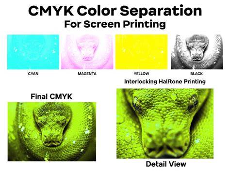
Photoshop For Screen Printing - CMYK Layer Separation Tutorial
In summary, CMYK screen printing is a capable method for achieving rich, photo-realistic results on light garments with a relatively lean toolset. It blends color theory, precise screen preparation, and disciplined press operation to deliver nuanced, vibrant prints. If this process seems daunting, professional guidance can help tailor a workflow to your specific designs and production needs.