According to Adobe, the Color Balance command controls an image's color distribution, achieving a balanced color effect. We all know that the color spaces used for displays (RGB) and printing (CMYK) are different, and there can be variations during the conversion process, resulting in inconsistent colors. The Color Balance tool's original purpose was to fine-tune an image's colors after converting the color space.
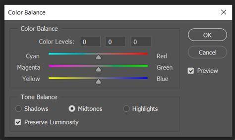
You'll notice that many color adjustment tools are based on these six colors: Red, Green, Blue, Cyan, Magenta, and Yellow. In the "Color Balance" tool, there are three adjustment options: the primary colors of light, which are Red, Green, and Blue. The Color Balance panel consists of 3 main workspaces: 1 dropdown menu, 3 sliders, and 1 option.
Understanding the tonal ranges and the dropdown menu
This dropdown menu allows you to select the tonal range for adjustment based on brightness. It's important to note that when you choose Midtones, it doesn't mean that the highlights and shadows are completely unaffected. This option provides a way to apply a trend-like adjustment. In our tutorial on "How to Read a Histogram," we share more information about shadows, midtones, and highlights.
How the color sliders work
These 3 sliders control the color bias in the image. When you slide the first slider to the left, the image becomes more cyan. Slide it to the right, and it becomes more red. These sliders directly modify the color tone of the image.
Preserving luminosity
In the bottom left corner of the Color Balance dialog box, there is a checkbox labeled "Preserve Luminosity," which is selected by default. If you don't select "Preserve Luminosity," when you drag one or more sliders to the right, you'll notice that the image tends to become brighter, even leaning towards white. Conversely, dragging one or more sliders to the left will make the image darker, tending towards black. In most cases, when retouching images, it's advisable to keep "Preserve Luminosity" selected to maintain the overall brightness of the image.
Practical workflow and tips
If you find the above three methods a bit cumbersome, consider giving TourBox a try. TourBox's configuration software, TourBox Console, comes with all of Photoshop's adjustment layers built-in, including Color Balance. Imagine controlling TourBox with one hand, effortlessly creating various adjustment layers, and swiftly adjusting parameters using the Knob control on TourBox. Once you have opened the Color Balance panel, using the tool should not be a problem.
- This is where the Color Balance tool becomes crucial for adjustments.
- Simply adjusting the color sliders won't fully unleash the magic of Color Balance. You can choose different brightness levels to adjust the Color Balance.
For example, take a look at the photo below. Now, let's take a look at the final result with a noticeable contrast between cool and warm tones. Shadows, midtones, and highlights correspond to the darker areas, middle-toned areas, and brighter areas of an image, respectively. You can try resetting the Color Balance settings and then readjusting them. Each image is unique and may require different settings to achieve the desired outcome. Absolutely!
1-Minute Photoshop - Advanced Color Correction in Photoshop!
| Aspect | Impact | Tip |
|---|---|---|
| Midtones | Trend-like color shifts that affect overall tonality | Choose Midtones for subtle shifts; preserve luminosity to keep brightness |
| Shadows | Warmer or cooler bias in darker areas | Fine-tune for depth; watch for clipping when pushing extremes |
| Highlights | Adjusts color bias in bright areas | Use conservatively to avoid washed-out regions |
In Photoshop, the Color Balance tool is most effective when used alongside histogram awareness and selective color adjustments. Remember that every image is unique, and rebalancing may require different settings to achieve the desired outcome.