In Adobe InDesign, curved lines can elevate layouts by adding flow, emphasis, and decorative detail. This guide synthesizes practical techniques for using the Line Tool effectively, covering line properties, custom strokes, dashed and dotted styles, and real-world layout use cases such as dividers, underlines, and decorative elements. The focus is on how to create, manage, and apply curved lines that integrate seamlessly with typography and imagery.
Line Properties: Weight, Color, and End Caps
Line properties define the visual impact of curved lines. Start by selecting the Line Tool and drawing a curve with control points or using Bézier adjustments to achieve the desired arc. Set stroke weight to control thickness, color for contrast or harmony with the page palette, and end caps to ensure clean terminations that suit the line’s role-rounded caps for softer curves, butt caps for precise terminations, or projecting caps for extended ends.
Consistent line weight helps maintain legibility, especially when lines interact with text. For sharp, crisp lines in print, use a clean stroke with an appropriate alignment relative to baseline text. For decorative lines, experiment with slightly heavier weights to create a focal divider without overpowering type.
Custom Strokes: Dashed, Dotted, and Beyond
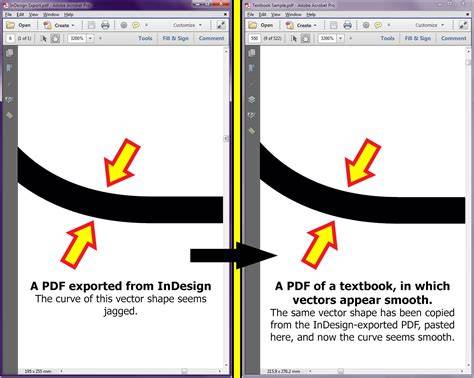
InDesign supports a variety of stroke styles beyond solid lines. Create dashed or dotted curves by adjusting dash and gap values in the Stroke panel. For more intricate looks, combine multiple dash patterns or use custom stroke styles that align with the project’s branding or mood. When applying custom strokes to curved lines, ensure that dash transitions follow the curvature smoothly to avoid visual jaggedness.
Advanced users can save and reuse customized stroke presets to maintain consistency across pages and documents. Consider tailoring dash patterns to typographic rhythm-short dashes near text blocks can act as subtle guides, while longer dashes can function as decorative separators without competing with headlines.
Layout Use Cases: Dividers, Underlines, and Decorative Line Work
Curved lines excel as layout devices that guide the reader’s eye and organize content. Use curved separators between sections to create a gentle flow without a rigid grid. Underlines can emphasize important terms or phrases, with curvature adding personality while preserving readability. Decorative line work can frame images, align captions, or connect related blocks of content in a cohesive composition.
When integrating curved lines into the back of a postcard design, consider guides for address and stamp placement, ensuring lines neither obscure text nor conflict with typographic hierarchy. Lines can also delineate zones for text, images, and contact information, helping to structure the layout in a visually pleasing way.
Practical Tips for Curved Lines in InDesign
- Use the Pen tool in conjunction with the Line Tool to create precise curves and control points.
- Lock stroke alignment to ensure consistent curvature across multiple instances.
- Utilize color swatches to rapidly apply brand-consistent hues to strokes.
- Experiment with stroke alignment (center, inside, outside) to fit the line within or around text and images.
- Group lines with related objects to preserve layout stability during edits.
Design Scenarios: Step-by-Step Examples
- Create a subtle section divider: draw a curved line, set a light stroke weight, apply a soft color, and choose a rounded cap for a friendly separation between content blocks.
- Underline a key term: draw a short curved line beneath the term, set a contrasting color, and use a modest thickness to avoid overpowering the text.
- Add decorative accents around images: position curved strokes around image corners or along the image edge with a mid-weight stroke and a complementary color.
- Plan postcard elements: add guides for address and stamp placement, then weave curved lines to connect visual elements while preserving clear typography.
Tables: Quick Reference for Stroke Settings
| Use Case | Stroke Style | Notes |
|---|---|---|
| Section divider | Solid, medium weight | Soft color, rounded caps |
| Underline | Solid or subtle dashed | Contrasting color, modest thickness |
| Decorative accent | Dashed, dotted, or custom | Brings rhythm without overpowering content |
| Guides for postcard layout | Neutral color, light weight | Provides structure for text and stamps |
Картинки и Видео для повышения информативности
Чтобы иллюстративно поддержать материал, можно добавить визуальные элементы: инфографику по типам линий и их применению, схемы, демонстрирующие работу со свитком кривых в InDesign, а также примеры готовых макетов с использованием кривых линий.