Today, I have a tutorial that even the most inexperienced Photoshop user could do, and it comes with pretty gorgeous results! I will be showing you how to brighten photos as well as other quick tips for making your photos pop. And by quick, I mean quick.
Curves: the foundation for brightening and tonal control
There are a few ways to brighten your photos, but first we’ll start with “Curves.” To access Curves in Photoshop, you can either go to Image >> Adjustments >> Curves, or press “command” and “M” at the same time. A little graph will pop up, like the one below. To brighten your photo, just drag the line on the graph slightly higher, similar to what mine looks like below. You don’t need to drag it very far to start seeing great results!
In this method, the curve acts as a midtone and highlight control, allowing you to brighten without sacrificing too much detail in shadows. For each of these tips, adjust the settings based on your own photos. In other words, using the exact same numbers and settings that I used in the example above won’t necessarily be ideal for your images.
Brightness/Contrast: quick global adjustments
This one seems like a no-brainer, right? To get brighter photos, adjust the brightness! To find this tool, go to Image >> Adjustments >> Brightness/Contrast. Then, drag the “brightness” scale a little to the right until you like the outcome.
The Brightness/Contrast adjustment lets you make simple adjustments to the tonal range of an image. Moving the brightness slider to the right increases tonal values and expands image highlights, to the left decreases values and expands shadows. In the new version of Photoshop CS3 and later, the Brightness/Contrast tool works much like the midtone slider in Levels, helping to brighten without clipping highlights or crushing shadows.
Color balance and tone: avoid unwanted color shifts
Lastly, your photo colors might be slightly off, which happens in imperfect lighting situations. If you compare the photo above to the one below, you’ll see that the above image is more yellow and the one below is more blue, which brings out the bright, crisp whites in the photo. Then, drag the cursors away from the colors you’re trying to decrease.
Over time, changing brightness and contrast can introduce color shifts. The use of color balance tools can help you keep whites clean while still achieving a brighter result.
Sharpening: add crispness after brightness boosts
Finally, it might make your photo pop if you “sharpen” it slightly. To do this, you can go to Filter >> Sharpen >> Sharpen, or press “command” and “F” at the same time. I don’t recommend over-sharpening it, though!
For each of these tips, adjust the settings based on your own photos. In other words, using the exact same numbers and settings that I used in the example above won’t necessarily be ideal for your images. Then, to save for your photo, go to File >> Save for Web.
Understanding the history and practical use of Brightness/Contrast
The Brightness/Contrast adjustment has evolved. Over the years, since Photoshop first appeared on the scene, many unsuspecting photographers and photo retouchers have fallen prey to the Brightness/Contrast command. The old version could brighten or darken an image but did so uniformly, washing out shadows and highlights. With the new versions, the tool behaves more like Levels and Curves, avoiding clipping in highlights and shadows while adjusting brightness and contrast.
To really understand how much better the new version of the Brightness/Contrast command is, you can switch between the old and new versions from within the dialog box by toggling the Use Legacy option. The new version allows you to maintain more nuance in midtones while controlling extremes, making it easier to preserve detail in both bright and dark areas.
Histogram as a guide to tonal balance
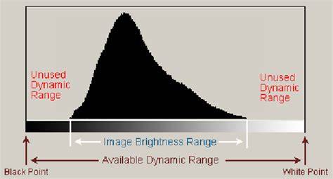
A quick look at the Histogram palette helps diagnose tonal balance. With the histogram expanded and set to RGB, you can see how shadows, midtones, and highlights are distributed. By adjusting Brightness/Contrast or switching to Curves or Levels, you can shift tones without flattening the image.
Practical workflow: steps you can follow now
- Open the image and assess exposure and color balance.
- Start with Curves to adjust overall brightness while preserving detail in shadows and highlights.
- Refine with Brightness/Contrast to fine-tune tonal range without clipping.
- Make targeted color adjustments to keep whites clean and colors natural.
- Apply a light sharpen to enhance definition, then review the histogram to ensure no clipping.
- Save using Save for Web or your preferred format and resolution.
Note on version differences and adjustment layers
Version differences matter: newer Photoshop versions introduce adjustment layers for non-destructive editing and better control. Adjustment layers can be edited and discarded to restore the original image at any time. Common Adjustments include Levels, Brightness & Contrast, Vibrance, and Color Balance.
Additional tips for consistent results
Always keep an eye on the histogram as you adjust, and remember that every image is different. There is no one-size-fits-all brightness or contrast value. If you’re ever unsure, add an adjustment layer so you can tweak later without permanently altering the original.