If you have ever tried adding a clean border to your digital lettering, you know that drawing it manually can be frustrating. Wobbles, uneven thickness and missed spots often ruin the look of an otherwise perfect design.
Open your artwork in Procreate and navigate to the layers menu. Swipe left on your original lettering layer and select Duplicate. With the bottom layer selected, open the Adjustments menu (the wand icon) and choose Gaussian Blur. Drag your Apple Pencil across the screen to the right until the blur effect reaches about 10%.
Next, tap the Selection tool (the S-shaped icon) and set the mode to Automatic. Tap directly onto your blurred lettering, then drag your pencil across the screen to adjust the selection threshold. Open your layers menu again and hide the blurred layer by unticking the box next to it. Create a brand-new layer directly above it. Choose the colour you want for your text outline from the colour palette. Tap on the new layer thumbnail and select Fill Layer.
If you want to add depth to your lettering, you can easily turn your new outline into a drop shadow. Duplicate the outline layer you just created, select the bottom version and use the transform tool to reduce its size slightly and shift it downwards.
Outline in a Few Clear Steps
- Duplicate the original lettering layer to preserve your work.
- Apply Gaussian Blur to the duplicate and adjust to about 10% for a subtle glow-like edge.
- Use Automatic selection on the blurred layer to define the outline region.
- Hide the blurred layer and create a new fill layer for the outline color.
- Optionally, add a drop shadow by duplicating and offsetting the outline layer.
Tips for a cleaner outline:
- Keep the outline slightly larger than the original to avoid gaps at tight curves.
- Use a color that contrasts with the fill for readability and impact.
- Experiment with blur amount and layer offsets to achieve the desired depth.
Practical Variations for Different Styles
To achieve a bold street-style outline, increase the blur and size of the offset, then use a high-contrast outline color. For a subtle, elegant look, keep the blur modest and use a color close to the fill color with a gentle offset. If you’re aiming for a soft halo around thin lettering, adjust the blur to a gentle level and slightly offset the outline away from the letterforms.
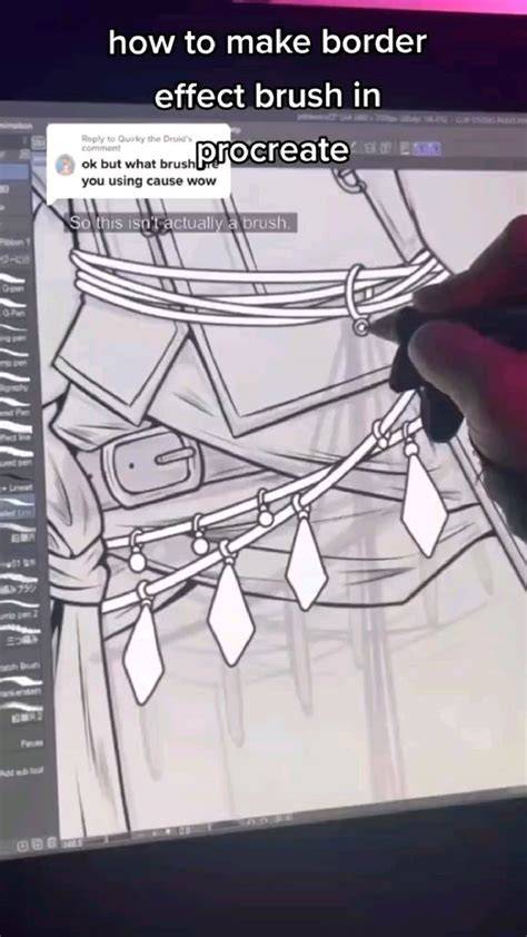
Procreate - Text Outline Tutorial
By duplicating the original, applying a controlled blur, and carefully defining the outline with a filled layer, you can achieve crisp, consistent borders without the usual wobbles. Adding a drop shadow can further enhance depth and legibility on various backgrounds.