Post-processing is an art form. Some photographers not only show us what the world looks like but also what it feels like. One way to achieve this feeling is by altering the colors in your image. Most photographers are familiar with global color changes like white balance and saturation. If you have never used the Split Toning panel in Lightroom, you are in for a treat. It is a subtle tool and one that photographers often ignore. We will explore what this tool does and how it has evolved into Color Grading in Lightroom version 10.
The Split Toning concept “splits” the tones in your image. In Lightroom, you can warm the highlights with a hue and cool the shadows with another. The new Color Grading tool looks and functions differently, but the principle remains: control colors in highlights, mid-tones, and shadows separately to craft mood, contrast, and atmosphere.
The evolution: Split Toning to Color Grading
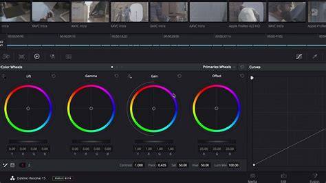
In Lightroom version 10, Adobe renamed the tool from Split Toning to Color Grading. The Color Grading panel is located within the Color panel in Lightroom CC and is designed to replace the old Split Toning workflow. The principle is the same, but the look is different: you now manage highlights, shadows, and mid-tones with color wheels instead of the previous hue/saturation boxes.
Three color wheels correspond to mid-tones, highlights, and shadows. Each wheel has a target point in the center; dragging toward the edge shifts hue, while luminance sliders adjust brightness. The interface also includes an eyedropper for sampling colors from the image, and a global adjustment option called Global Toning. This new approach encourages color relationships and offers a broader palette for creative experimentation.
How Color Grading works: a practical guide
Color Grading looks at three tonal ranges-highlights, mid-tones, and shadows-separately. The Hue and Sat controls are replaced by the color wheels, and the luminance sliders under each wheel refine brightness. The eye icon and the swatch/eye-dropper let you sample colors already present in the scene for a cohesive look. A key benefit is that you can counteract unwanted tints or add a cinematic feel by choosing complementary colors and adjusting their intensity.
The Global Toning option modifies the overall tint of the image, similar in spirit to white balance adjustments but applied globally. This tool makes it possible to push a photo toward a warm sunset or a cool evening, while still preserving localized color decisions in highlights, mid-tones, and shadows.
Color Grading can also be used to colorize black-and-white images. Even when no color information is present, the conversion preserves a channel for color shifts that affect how tones are perceived, offering additional avenues for mood and atmosphere.
Color theory in practice: choosing relationships
Color theory remains a guide for harmonious combinations. Three common relationships are complementary, analogous, and triadic. Complementary colors (opposite on the color wheel) often create cinematic drama when applied to highlights and shadows, such as warm yellows/oranges with cool blues. Analogous colors-colors next to each other on the wheel (e.g., teal and blue, or yellow and green)-provide more cohesive, less contrasting looks. A triadic scheme divides the wheel into three balanced hues for vibrant scenes.
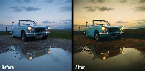
In practice, a popular Split Toning (now Color Grading) recipe is warming highlights with yellow/orange hues while cooling shadows with blue hues. The teals-and-oranges combination remains a cinematic staple, achieved by sampling and tweaking colors on the wheels. The result is a moodier, more cinematic appearance with controlled color contrast rather than global shifts.
Tips for effective Color Grading
- Start with subtle color: aim for a barely perceptible tint to maintain natural look while adding mood.
- Move from Highlights to Shadows, then refine with Mid-tones for balance.
- Use the eyedropper to sample colors from the scene to ensure cohesion with existing tones.
- Experiment with the Blending and Balance controls to fine-tune how colors overlay across tonal ranges.
- Combine Color Grading with other Lightroom tools or external plugins to enhance overall mood (e.g., contrast, clarity, or denoise) without overdoing color.
Practical use cases: from realism to cinematic
Realistic edits: A common approach is to warm highlights (yellows/oranges) and cool shadows (blues) to mimic natural lighting and create a pleasant separation without dramatic color shifts. This is especially effective for landscapes or outdoor scenes where a subtle cinematic feel is desirable.
Cinematic looks: Teals and oranges or teals and magentas provide bold, film-like moods. By adjusting the luminance of each wheel, you can sculpt where the color influence falls within the image, creating that signature cinema vibe while maintaining control over the scene’s integrity.
Creative and abstract: Color Grading can push images beyond reality by using unusual color placements, shifting mid-tones to magenta or green, or isolated color surges in the highlights for artistic impact. The color wheels are designed to encourage experimentation with color relationships rather than rely on flat global edits.
Workflow considerations: when to use Color Grading
Color Grading is typically used after primary corrections (exposure, white balance, contrast) and other local adjustments. Some photographers treat it as a finishing touch, while others weave it into their broader processing chain. In some workflows, you may start with Color Grading early to guide mood and then refine with broader color and tonal adjustments later.
Note that while Color Grading offers a streamlined, elegant interface, it can be easy to overdo; a subtle approach often yields the most professional results. A quick before/after reference helps maintain perspective on the original look.
Supplementary tools and comparisons
Color Gradings’ color wheels can be easier to use than the prior hue/saturation panels since they frame color decisions in a relational context. Some photographers compare Color Grading to the Photoshop Color Balance concept, where colors interact in opposing relationships. The eye-dropper and preset options provide quick paths to experimenting with color combos, while the Global Toning option offers a broader mood shift across the entire image.
Getting the most out of Color Grading
To maximize impact, begin by selecting a hue at the edge of a wheel and then bring the target toward the center to reduce the effect, or push toward the edge to intensify it. A little color goes a long way, and a restrained approach often yields a more refined result. Practicing with different scenes and lighting conditions will help you understand how subtle shifts influence mood and tone.
As you build familiarity with Color Grading, consider using it in portrait lighting to correct skin tones subtly or to harmonize color casts introduced by environments. The tool’s ability to counteract color casts while preserving local tonal adjustments makes it a powerful addition to any post-processing workflow.
Finally, the Color Grading tool can be used in conjunction with presets or as a creative foundation for developing your own signature style. Saving color grading configurations as presets allows rapid application to future images, helping you maintain consistency across shoots or projects.
In summary, Lightroom’s Color Grading (formerly Split Toning) provides a structured yet flexible framework for color-based storytelling. By targeting highlights, mid-tones, and shadows with color wheels, photographers can craft mood, atmosphere, and depth with precision and artistry.
Note: The Color Grading panel replaces traditional split toning and brings a modern, wheel-based approach to selective color adjustments in Lightroom.