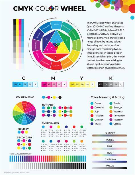
One of the more popular of the “primary” palettes for painting you might have heard of is the CMYK palette. The “primaries” here are cyan, magenta and yellow. I’ll be honest: Before I started looking seriously at this palette I was extremely sceptical of it. Why? Well, funnily enough, at the level of light and colour, it’s not that different - especially when we’re taking about glazing. The wonderful David Briggs explains why, they both use a combination of additive average mixing and subtractive mixing. That doesn’t mean to say I think it’s a good idea to paint with it, not at all. I’ll get on to that later.
But it’s not as simple as it first seems. Whilst investigating this palette I learned some very interesting things, which I’ll share with you at least in abbreviated form here. No, I’m not going to go into real depth on that in this post. If you’re interested in really learning where all these various primary theories came from, I strongly recommend reading his site in depth. Probably more than once.
Basically, CMY are the subtractive primaries. The thing is, there are two different ways this palette is used in painting, that I’ve found. The first is using the colours as transparent glazes over a bright white ground. The second is painting opaquely - as we would normally understand it, mixing those primaries with white (and black, if you like).
I mean wow, look at that. Even in reproduction it’s pretty amazing. The colour is unlike any colour I’ve ever seen in oil painting. Not because the chromas or hues are unachievable any other way, but because it’s so idiosycratic! Although it’s painted, it looks like it’s printed. But the real world simply doesn’t look like this. In fact, Maxfield Parrish was directly influenced by the printing process he saw and attempted to replicate it in paint. And he came pretty close!
Now, it strikes me that if you’re going to paint like this, you’re going to have to be extremely meticulous and organised, planning every stage several steps ahead. It ought to be possible, in theory, to paint realistically using this method, but I think it would be so difficult as to be very nearly impossible. Here is an airbrush photo realist, Don Eddy working in a similar way, but with different pigments; violet, phthalo green and burnt sienna. You can find out more about this process here.
Looking at both those methods closely, it appears very much to me that there may some projection or even direct printing of the photo reference they start from onto the canvas. That doesn’t make it bad. It doesn’t mean it isn’t art. But I would consider it to be a different art form than the one I’m involved in, and probably yours too, if you’re reading here.
Ok, I’ve got to come clean here. I haven’t finished my tests with this yet. I’m doing some test mixes to find out what range of colours you can mix with this palette, and also to see what it’s like to try to mix low chroma colours with. I’m also doing some basic glazing tests to see what chroma can be reached, and that’s taking a little while because paint has to dry between layers.
Well, possibly, yes. I’ve seen at least one video on youtube where an artist was mixing tube paints together in the usual way, ostensibly CMY, but without using white. What she was doing was adding very large amounts of medium in order to make the paint more transparent. Personally, I find that more than a little worrying. Everything we know about longevity of paint films goes against this. It’s a good rule of thumb to use as little additives as you possibly can, especially resins.
The most common pigments I’ve seen recommended are, for the cyan PB 15.3 - Phthalocyanine blue. For the magenta, usually a quinacridone. I’m using PV 19, quinacridone rose, in my tests. For the yellow, PY 74 seems a popular choice, and is the one I’ve been using.
A quick word here, because this bothers me. There are paint manufacturers putting out what they call process colours, or primary cyan, magenta and blue. What bothers me about this is that it tends to suggest that there’s something special about these particular tube paints, something different: There isn’t. The cyan in particular, in the Talens range, includes PW 7 - Zinc white. Maybe. I’d agree with that, except that personally I don’t see the need to start with primaries if you’re choosing a fuller palette. To me, I would just make sure that you hit a good chroma in a wide range of values all around the hue wheel, and then, as David suggests, add black, white and earths to make low chroma colours easier to mix. But I’ll think a bit more about that.
It may be because I use a different mixing method than most, one I find to be much more effective and which allows finer control. If you’re mixing with white and not glazing, then you can mix a wider gamut - and so paint with more chroma - with a wider set of tube paints. I can’t see how using such a restricted palette will help you learn to mix better, or paint better, come to that. So really, the only real reason I can see for using this palette is that you want to use very few paints and get the widest gamut you can with them.
Of course, these are just my thoughts after messing about with it for a few hours. You could say that was unfair, and you may very well be right. Regardless, I would really like to hear from anyone who habitually uses this palette. If you can demonstrate your points with examples of your work, or work by other artists you admire that you feel demonstrates what you’re saying, that would be really helpful. This conversation is ongoing and I expect to learn more from it as it unfolds.
tags: #cmyk #color #combinations