The design industry is a perpetual pendulum between craft and technology. Our files and processes are constantly in motion: new frameworks emerge, guidelines are updated, and tools push boundaries that seemed unthinkable a year ago. This month that pendulum swung again as the W3C design tokens specification hit stability and Figma announced extended collections in its Schema 2025 update. Together they hint at something bigger: a future in which tokens and variables become the lingua franca for multi‑brand design systems.
What does that mean for working designers? It means your library of 2 000 colours and spacings will soon live in a standard format. It means your team’s dark mode, holiday theme and client‑specific palette will travel across design, code and marketing channels without friction. And yes, it probably means that someone will ask you, “Can’t AI just style this automatically?” sooner rather than later.
In this long‑form guide I’ll triangulate what’s happening, why it matters now, how to prepare your files within a week and what pitfalls to avoid. I’ll adopt the friendly, lightly playful tone you’re used to seeing on my channel; expect a smart quip every so often to keep things human. Buckle up, because the world of design tokens is about to get very real.
A quick recap: tokens versus variables
If the W3C specification is new to you, you might be wondering whether design tokens are just marketing speak. In fact, they are well‑defined: a design token is an indivisible piece of UI information expressed as a name/value pair. Tokens encapsulate a colour, a spacing value, a typography choice or any other atomic property that forms the basis of a UI. Supernova’s primer explains that design tokens are platform‑agnostic and map to variables in design tools like Figma. Figma’s variables, introduced at Config 2023, let you store reusable values in your design files. Variables support aliasing, scoping and multiple modes (light, dark, high contrast) so you can switch entire themes without editing every component.
Design tokens and variables are related but not identical. Variables live inside Figma files and can alias other variables. Design tokens are an external representation defined by the W3C that can be consumed by any platform, from CSS to Swift to Flutter. The beauty of the new specification is that it allows for a standard format across tools and languages. Figma’s extended collections will let you group variables into collections representing multiple brands, clients or contexts. It’s like having an Excel workbook where each sheet is a brand and each cell is a variable; extended collections unify those sheets under a single structure. If that analogy didn’t make you think of spreadsheets, consider this: your style dictionary in a JSON file is about to become as important as your component library.
The W3C design tokens spec enters stability
On October 2025, the W3C Design Tokens Community Group announced that its specification had reached stability. This means the format and semantics are considered production‑ready and vendors can implement with confidence. The spec defines how tokens should be structured, how they can reference other tokens and how modern colour spaces and complex relationships (like gradients and semantic scales) are represented.
- Theming and multi‑brand support: tokens can be grouped into themes that override base values, enabling design systems to support multiple brands or seasonal themes without duplicating definitions.
- Modern colour spaces: built‑in support for OKLCH, CIELAB and future colour models ensures tokens can capture nuance beyond standard RGB.
- Rich relationships: tokens can reference other tokens, define scales (e.g. typographic sizes), and include metadata such as descriptions, aliases and tags.
- Cross‑platform generation: the spec deliberately avoids prescribing how tokens should be consumed, enabling generation of CSS variables, Swift constants, Android resources and more from a single source.
By standardising these concepts, the specification solves a pain point that has plagued teams for years: every tool and library has defined its own token format, making it hard to synchronise design and code. With the spec, you can check in a tokens.json file to your repository and know that your design tool, your Storybook theme and your mobile app can read it.
Figma’s Schema 2025 and extended collections
Figma didn’t sit still either. In its Schema 2025 update, the company announced several features that raise the bar for design systems. The headline item for our story is extended collections. Previously, variables lived in collections (Colour, Number, String, Boolean) and you could apply variables via tokens in your components. Extended collections allow you to create additional collections that represent brands or contexts; they inherit base definitions but allow overrides. According to Figma’s help article, extended collections will roll out in November 2025 to Enterprise customers and will be available at scale. They’ll let designers manage multi‑brand systems in a single library and choose which collection to sync when handing off to developers.
Figma’s blog post about Schema 2025 highlights other improvements that complement extended collections: check designs, a linter that analyses frames for consistency and automatically suggests where variables should be applied; Slots, a new concept that lets you define placeholder content inside components, making it easier to compose design tokens and components at runtime; and Performance, with the team claiming 30-60% faster variable evaluation and library loading. With many teams complaining about sluggishness when working with thousands of variables, this improvement is non‑trivial.
MCP Server and Code Connect UI are introduced as new infrastructure for bridging design and code. The Code Connect UI will let developers preview tokens and components live from Figma, while the Multi‑cloud Platform (MCP) Server ensures that assets are synced across geographies. One might summarise Schema 2025 as Figma’s attempt to industrialise design systems. Extended collections are the spearhead of this movement because they align Figma with the W3C spec: a standardised, multi‑brand, multi‑mode design token structure that can be exported to code.
Quip: If design tokens are the new steel beams of digital products, then extended collections are the cranes that let you build skyscrapers without mixing up the bricks.
Trend truth check: hype or reality?
When we evaluate a trend, we must separate marketing spin from substance. I triangulated the announcement across primary sources and community analysis. The W3C spec has reached stable status, and Figma’s Schema 2025 public materials detail extended collections and other tooling improvements. The combination points toward a real, actionable trend for enterprise teams running multi‑brand work. My confidence in this being a real trend is roughly 0.75.
Rating: Maturity Accelerating - spec stable, major tool support imminent. Search demand is high, evergreen moderate, difficulty moderate, and the potential payoff sizable.
So what? Why should you care, and what can you do within a week? Let’s answer with a quick, practical loop.
So what? The practical takeaways
Tokens will soon be universal. So what? Your design system can plug directly into developer workflows. Within a week: audit your current styles and variables; identify which values could become tokens.
Figma’s extended collections enable multi‑brand design. So what? You can manage brand variants in one file and avoid duplicative libraries. Within a week: sketch how your existing library could be split into base and brand‑specific collections.
The spec supports modern colour spaces and semantics. So what? You can adopt OKLCH or other perceptually uniform spaces for accessible, flexible palettes. Within a week: pick one base colour palette and experiment with OKLCH conversions.
Tokens require naming conventions and governance. So what? Without a solid naming scheme, tokens become chaos. Within a week: define a naming pattern and test it on a few tokens.
If your team doesn’t do these things now, you’ll find yourself scrambling when your product manager asks why your multi‑brand platform still uses hex variables from 2015. And you might be tempted to copy large design token libraries from the internet. Resist that urge; tokens work when they are a reflection of your product’s design language.
Outline of the article
- Understand design tokens and variables - definitions, differences, and why they matter.
- Analyse Figma’s extended collections - how they work, who gets them, and why they matter.
- Prepare your files - a quick‑start audit and 1‑hour rollout for converting styles.
- Team handoff and micro‑plays - roles for designers, leads and implementers.
- Worked example - convert a button component to use design tokens and multi‑brand variants.
- Decision aid - when to adopt tokens, when to wait.
- Validation and metrics - how to measure success.
- When not to use tokens - caveats and pitfalls.
- Near‑future forecast - what’s coming in the next year.
- Call to action - tying it together and pointing you to more resources.
Quip: A map isn’t useful if you don’t know where you are; hopefully by the end of this article you’ll know exactly where your design system stands.
Practical Playbook
Below is a comprehensive, yet adaptable playbook to help you adopt design tokens and prepare for Figma’s extended collections. Feel free to adjust steps based on your toolchain and team size.
- Quick‑Start (15 minutes)
Audit existing styles: Open your Figma file and run the “Variables” panel. Write down how many colour, number, and string variables you have. Categorise by purpose: Identify which variables are brand‑agnostic and which are brand‑specific. Name tokens consistently: Draft a naming scheme such as brand.category.role.state. Create a basic token file: Use a tool like Style Dictionary or a simple JSON template following the W3C format. Export a few variables from Figma and inspect the structure. Identify stakeholders: List the designers, developers and PMs who need to be involved. - 1‑Hour Rollout
Set up a token repository - Create a design-tokens folder in your version control system. Add a README explaining the W3C spec and your naming convention. Export variables - Use Figma’s REST API or plugin to export existing variables to JSON. Define extended collections - In Figma, create collections for each brand and assign overrides for brand‑specific variables. Map tokens to variables - Use a tool like Token Studio or a script to map your base.tokens.json into Figma variables. Apply tokens to components - Start with a core component, such as a button. Replace static style definitions with variable references. Test multiple modes/brands - Switch between collections to ensure that overrides apply correctly. Fix any mismatches. Commit and document - Push changes to the repository and update the README with examples. - Team Handoff
Artifacts to deliver: tokens.json, Figma file with variables applied and extended collections set, a brief spec document summarising naming conventions and guidelines. Acceptance checks: All components use variables; Switching collections updates the UI; Developers can import tokens into code. - Role Micro‑Plays
Solo designer: audit and define tokens; use built‑in variable support to convert a page to tokens; document decisions. Design lead: decide naming conventions, governance and rollout timing; review tokens for consistency. Implementer (developer): integrate tokens into code; write a script to watch for token changes and regenerate theme variables; participate in testing. - Worked Example: The Button
Two brands: Acme (corporate) and Nova (playful). Define base tokens and brand overrides; create collections Base, Acme, Nova; apply variables to button component for fill, text, border radius, and font size; switch collections to preview updates without manual editing. - Decision Aid (table)
A simple matrix to help decide when to adopt design tokens and extended collections.
Worked example: The button in two brands
Define base tokens: color.primary, color.onPrimary, radius, font sizes. Create collections: Base, Acme overrides primary to a corporate blue, Nova overrides primary to a playful pink. Apply variables to button: fill references brand.color.primary, text references brand.color.onPrimary, border radius references brand.color.radius, font size references brand.font.sizeMd. Switch collections to see instant updates in the UI.
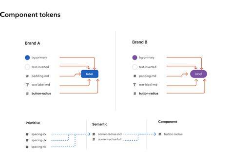
Note: This example illustrates how extended collections enable multi-brand variants from a single library, reducing duplication and friction during handoffs.
Decision Matrix and near‑term forecast
In the near term, expect stabilized token formats, broader tool support, and more examples of cross‑platform generation. The practical plan is to audit, set governance, experiment with one base palette, and incrementally add brand collections as your team gains confidence.
What the #&%$ are Design Tokens?
Forecast: tokens become a living contract between design and code, with extended collections acting as the chassis for multi‑brand ecosystems. As teams standardise token usage, tooling will become more capable of shipping consistent experiences across platforms and channels.
Table: Quick comparison of tokens vs. variables vs. extended collections
| Aspect | Design Tokens | Figma Variables | Extended Collections |
|---|---|---|---|
| Definition | External, standardised name/value pairs for UI properties | Internal values stored in Figma files | Grouped collections representing multiple brands/contexts with overrides |
| Scope | Cross‑platform (CSS, Swift, Flutter, etc.) | Design tool only | Multi‑brand, multi‑mode within a single library |
| Accessibility | Supports modern color spaces and semantic relationships | Dependent on design file structure | Enables easy switching between brand themes |
| Usage | Exportable tokens used by codebases | Directly used in design components | Overlays and overrides for brand variants |
In summary, the convergence of the W3C Design Tokens Specification and Figma’s Schema 2025 with extended collections paves a practical path to scalable, multi‑brand design systems. By starting with a quick audit, defining governance, and gradually introducing brand collections, teams can align design and code with a robust standard.
tags: #extended #collections #figma