As a front-end developer with a deep commitment to UI quality and architectural integrity, I’m always looking for tools that don’t just “do the job”, but elevate the entire process. One such tool that’s become a non-negotiable part of my client-side workflow is Style Dictionary. At its core, Style Dictionary is a design token management tool. But in reality, it’s much more than that: it’s a bridge between design and code, a systematic foundation for scalable UI development, and an automation powerhouse that enforces consistency across technologies. If you’re serious about front-end architecture and UI integrity, let me explain why this tool deserves a permanent spot in your arsenal.
Design Tokens: The Language of Scalable Design
Design tokens are the atomic values that define your design system: colors, font sizes, spacing, shadows, border radii - you name it. These tokens represent the “what” behind a design, and they should be shared across teams, tools, and platforms to ensure consistency. The problem? Designers live in Figma, developers live in code, and often, there’s a game of broken telephone in between. That’s where Style Dictionary shines.
What Makes Style Dictionary So Powerful?
Style Dictionary is not just a token manager. It’s a full-fledged build system for transforming and distributing design tokens into multiple formats. But beyond the buzzwords, here’s how it has become irreplaceable in my workflow.
1. Cross-Platform Token Generation
One of the biggest reasons I adopted Style Dictionary is its insane flexibility. It lets you define your tokens in a single source of truth - typically JSON, but also JavaScript files, which opens the door to dynamic generation and transformation. For instance, you can use libraries like color.js to calculate color scales, contrast pairs, or accessibility-compliant variants on the fly. This programmatic approach makes your token system not only expressive but also smart - and outputs them into any format you need: SCSS variables and Sass maps for component styling; CSS custom properties for native CSS usage; TypeScript or JavaScript constants for direct consumption in apps; TailwindCSS-compatible JSON for extending your utility classes; Android XML, iOS tokens, even JSON Schema or tokens for Figma plugins. For instance, you can use Style Dictionary to generate: _variables.scss for Sass-based styling; tokens.ts for direct usage in a React+TypeScript app; tailwind.tokens.json for extending Tailwind’s config with semantic values. One definition. Infinite outputs. That’s the dream.
2. Customization That Feels Like Home
Style Dictionary is built with extensibility in mind. You don’t just use it - you shape it. I’ve written custom formats to align token output with my naming conventions, created filters to scope tokens per platform, and even built custom parsers to import token definitions from non-standard sources. Its plugin system lets you override nearly every part of the build process. Remember me for faster sign in. Need camelCase variables in JS but kebab-case in CSS? No problem. Want a custom header comment in every generated file? Easy. Want to inject metadata or use aliases? You got it.
3. One Source of Truth, Many Environments
One of the core principles I live by as a UI developer is DRY - Don’t Repeat Yourself. Style Dictionary is the embodiment of that principle for design values. Rather than defining spacing in your CSS, JavaScript, and Figma plugin separately, you define it once - say in tokens/spacing.json - and Style Dictionary ensures that all environments get their flavor of the same truth. This keeps teams aligned, minimizes human error, and makes onboarding new devs or designers a breeze. When someone asks “What is our primary brand color?”, there’s only one place to look.
4. First-Class Integration with Design Systems
As someone obsessed with Storybook, modular UI components, and scalable design systems, Style Dictionary fits right into my workflow. It acts as a translator between abstract design ideas and the concrete, typed, testable implementation that I care about. Whether I’m working in Vue, React, or even Angular, I can inject semantic design decisions into my components without breaking a sweat. What I especially love is how it supports theming. You can define token sets per theme (e.g., light/dark), and generate theme-specific output files.
5. Scalable Build Process
When your design system evolves (and it always does), running style-dictionary build regenerates every output file with your latest tokens. No more hunting down individual variables or manually syncing code with Figma screenshots. Just one command, and your styles are up-to-date across the board. This alone saves me hours every week and prevents the slow drift of design drift - where things subtly start to look “off” across platforms.
Figma Integration: Closing the Loop
What makes Style Dictionary even more compelling today is its potential integration with Figma, via plugins and third-party bridges like Tokens Studio. This opens the door to two-way synchronization between your design system and your codebase. With tools like Tokens Studio: You can export design tokens from Figma directly into Style Dictionary-compatible formats. You can also import tokens back into Figma, ensuring that designers and developers work from the same source of truth. This doesn’t just increase efficiency - it prevents token drift, eliminates manual syncing, and fosters real collaboration between design and engineering. When designers update a color or spacing scale in Figma, those changes can be propagated to your codebase automatically - and vice versa.
The Setup: Easy to Start, Powerful to Master
If you’re thinking “this sounds complex”, let me stop you right there. The initial setup is surprisingly simple.
- npm install --save-dev style-dictionary
- Provide a minimal configuration (style-dictionary.config.js):
module.exports = { source: ['tokens/**/*.json'], platforms: { scss: { transformGroup: 'scss', buildPath: 'build/scss/', files: [{ destination: '_variables.scss', format: 'scss/variables', }], }, ts: { transformGroup: 'js', buildPath: 'build/ts/', files: [{ destination: 'tokens.ts', format: 'javascript/es6', }], }, },};The token source could be as simple as:{ "color": { "primary": { "value": "#ff5722" } }, "spacing": { "small": { "value": "8px" } }}
Run style-dictionary build and boom-your _variables.scss and tokens.ts are generated.
Example of Design Tokens in Practice
Design tokens are the visual atoms of your design system - named entities that store values like colors, typography, spacing, radii, shadows, and more. They’re platform-agnostic, meaning the same token can be transformed into CSS variables for the web, Swift code for iOS, or XML for Android. Notice how Text.primary references another token ({Colors.Gray.900}). This creates semantic relationships that adapt across themes. Our architecture supports three layers of theming: Base Themes, Vendor Themes, and Semantic Tokens. The Token Structure and Build Workflow illustrate a scalable, multi-theme approach that can be extended across platforms and vendors.
Build and Theming: Practical Workflow
Step-by-step workflow includes exporting tokens from Figma, configuring Style Dictionary to transform tokens into CSS variables, and enabling theme switching in React by toggling a data-theme attribute on the html element. Vendor overrides are tiny override files, not full duplicates, allowing for minimal duplication and maximal flexibility. An interactive demo component can illustrate how tokens change the UI in real time as themes switch.
Benefits of This Approach:
- Single Source of Truth - Designers update in Figma → developers get synced tokens.
- Automatic Consistency - Semantic references keep everything aligned.
- Vendor Flexibility - Minimal overrides, no duplicated themes.
- Cross-Platform - Web, iOS, Android all from the same tokens.
- Scalability - Adding a new theme is just one JSON file.
Build Process Integration
Integrate tokens into your build with scripts that generate outputs for light and dark themes, and wire them into your app’s styling pipeline. For example, you can add scripts to npm to build light and dark tokens, then a combined build step to produce assets used by your app. This ensures you stay in sync as tokens evolve.
Conclusion: A Practical, Essential Tool for Front-End Architecture
Style Dictionary isn’t flashy. It’s a rock-solid, scalable solution to a fundamental problem in front-end development: keeping design and code in sync. It empowers me to maintain UI consistency across codebases, platforms, and products. It gives structure to chaos and helps communicate design intent with precision. For any front-end developer who takes UI architecture seriously, it’s not just useful - it’s essential. If you’re tired of chasing down color values in random files, syncing hex codes from Figma by hand, or watching your design system fall apart as it scales - give Style Dictionary a try. I did.
Note: As long as you are running TailwindCSS and ReactJS, having your app run on Next.js is not required. Figma - A spectacular UX Design tool. Design Tokens | Figma Community - An excellent plugin that exports Figma color/typography into a design tokens, which is a JSON file that Style Dictionary can parse. Style Dictionary - Converts design tokens to multiple formats, including JS, CSS, Android, and iOS native files. In this example we’re exporting to a commonJS module. daisyUI - “The most popular, free and open-source Tailwind CSS component library.” Create fully styled cards, alerts, carousels, form fields, and more. with vanilla html elements and a Tailwind class.
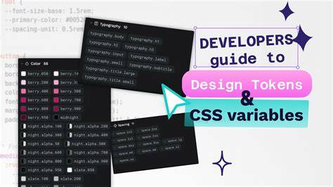
What’s Next: Automating Figma → GitHub → CSS Variables
This article focused on the what and why of a token-driven theming system. The how of automation - hooking Figma to your repo so tokens are fetched and compiled to CSS variables automatically - deserves its own deep dive. In the next installment, I’ll cover Figma → GitHub Sync, creating a Figma API token, pulling token JSON from Figma, storing theme files, and building a robust CI workflow to ensure token integrity across releases.
Figma Tip: Syncing variables to code
tags: #style #dictionary #figma