Rendering in digital art is the process of taking a painting from a rough state to a more polished finished state. Rendering is usually done in several distinct stages. Originally, the term rendering comes from 3D computer graphics. 3D objects are created and placed in an environment. Then they are processed with fancy techniques like vertex shading, texture-mapping, bump-mapping and whatnot - mostly with the goal to make it look real. These techniques (and more) are all used to make video games look good, for example. In digital painting, the term rendering is commonly used, as well. Probably because it’s also made with a computer.
It all starts with a sketch. That sketch can then be worked on more thoroughly to get a cleaner preliminary drawing. Then flat colors are put down, light and shadow are added and colors get blended. IMPORTANT: We will look at these stages in isolation and you can actually paint this way. It’s especially helpful for beginners because it helps them to focus on each step separately. As you get more advanced though, these stages will naturally become blurred and you might be painting several things at the same time.
For example, an experienced artist might omit a preliminary drawing and go straight to flat colors. Here you try to simplify what’s in your head and just put something on the canvas. The goal is to get started! Note: I didn’t use a preliminary drawing in this painting. This is an optional step that many artists skip. You should do this step if you are a beginner and lack experience. A preliminary drawing can help you get a cleaner result. You can skip this step if your skills are pretty advanced already and you don’t need the exact outlines to guide you while painting. Note: If you want to create digital comic art, you obviously need this step.
In this step, you paint the basic colors of your characters/objects without considering light and shadow or textures. In this stage, you focus on shading your painting. This stage can really make or break your painting. It’s too much to cover in this guide and requires separate tutorials. Paint on separate layers: You can paint light and shadow on separate layers, too. This way you can change the lighting situation without affecting your base colors. You can even paint these on two separate layers, one for light and one for shadows.
In nature, light rarely creates hard and flat shadow shapes. Instead, light and shadow often transition into each other softly. How do you blend colors effectively? That’s a complex topic for another article. By now, your digital painting should already look quite good and three-dimensional. That’s when it’s time to add more details and textures. These make your whole painting more interesting because it offers the eye something to explore.
The above should have given you a solid overview of how a digital painting is made. But what if your digital art looks bad? That’s fine, if you want to paint cartoons. Rendering digital art requires painting soft edges where needed (see #1). Blending means mixing two adjacent colors to create a smooth transition between them. Once you’ve mastered it, you will probably find that you use it all the time during painting. The approach I recommend to beginners is to use a basic round brush and set the pen pressure to “opacity”. If you want to, you can also try some different tools/techniques like the smudge tool, the mixer brush, or something similar (depending on the painting software you use).
Edge control and blending can already take you quite far. But without textures, your art will probably look sterile and fake. However, I don’t recommend these to beginners. Instead, my advice is to paint textures by hand. Textures go hand-in-hand with materials. The material affects the degree of reflectivity of an object.
I recommend checking out resources and courses for further depth. Industry expert Hardy Fowler reveals the secrets of digital art. With guidance, you can explore additional techniques and workflows. That means you can check out related courses and tools that suit your pace and goals.
Hard vs. Coloring and painting skin can be quite tricky. Many artists struggle with it, seeing how different it is when coloring skin digitally. With Clip Studio Paint, we get to utilize every feature that helps when coloring digital art. In this guide, I’ll cover the step by steps of coloring skin optimally while also discussing how to improve the realism of skin tones by discussing values, color relationships, reflected light, and subsurface scattering along with video processes of them.
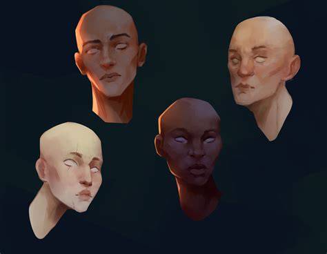
Begin by selecting a base color that represents the mid-tone of your character's skin. This foundational layer sets the stage for subsequent shading and highlighting. This is what we will be working on today. I have made 4 separate layers; line art, hair, clothes, and skin. Subsurface scattering is what makes skin look soft and realistic in digital art. When light hits the skin, it doesn’t just bounce off the surface, as it goes inside a little, bounces around, and comes back out in nearby areas. The result is that areas like ears or noses often have a warm, slightly glowing red or pink tint when light shines through them.
In digital art, while you can do it manually, the most optimal way to add shadows would be to utilize blending modes. First, create a new layer above your skin base color. Take a darker, more desaturated color of your chosen skin tone and fill the whole layer with that color. This is where blending modes will come in handy, as it has given you a shadow color appropriate for the skin tone as well as the color you chose. Skin does not exist in isolation, it reflects and absorbs colors from its surroundings. If you want your character to feel like they belong in their scene, you must consider environmental light reflections. One thing you should remember is that if you’re going for a realistic look, shadows should never have stronger or purer colors than the mid-tones unless you're making an intentional artistic choice. Mid-tones, on the other hand, carry the most vibrant color information because they receive direct illumination without being overexposed like highlights, as light can also cause colors to lose saturation.
After creating a Multiply layer for shadows, determine the light source and its characteristics. Consider its direction-is it coming from above, the side, or behind the subject? Identify its intensity; strong light creates harsh shadows, while soft light results in gradual transitions. The amount of light affects how much of the skin remains in shadow. Since we are starting on shadows and lights, value plays a crucial role in making skin appear realistic. Strong lights will cast stronger, darker, bolder shadows when compared to a softer light source. Many artists mistakenly rely on mid-tones for defining form, leading to a dull and flat look. Instead, let the transitions between light and shadow create the shape.
To set our starting point, lower the multiply shading layer to suit your lighting scenario. I like to use a soft airbrush to erase parts that are hit by light just ever so slightly. Now for the fun part! After airbrushing to give some variety, start erasing bigger shadows from areas exposed to light. In this case, I am using the Round Mixing Brush with transparent/no color selected. Begin with large sections using a hard brush, gradually refining as you go. Pay close attention to face planes, broad areas should be corrected first before focusing on smaller details. And I cannot stress this enough, but please start with big shapes and big shadows.
Shadows on the face require both sharp and soft edges depending on location. The sides of the face where light gradually fades, the area under the cheekbones, and other regions will guide edge softness. Terminators, where light transitions into shadow, play a key role in making skin look more lively and dimensional. Instead of a flat transition, you can introduce richer colors at the terminator to mimic how light scatters in real life. This effect is especially noticeable in skin due to subsurface scattering, where some light penetrates the surface before bouncing back. The terminator often has a warmer, more saturated hue compared to both the highlight and the shadow.
To apply the terminator color softly, you can use an overlay or soft brush. After that, go above with a new layer for lighter tones, using Screen or Add blending mode. When picking colors for highlights, stay away from pure white and consider the light source color. Darker skin tones often reflect more light in highlight areas, creating a stronger contrast between light and shadow. The color undertones, such as warm reds, deep browns, or cool purples, can be subtly incorporated into shading to enhance realism.
Overpainting helps refine and unify the piece by painting over the line art. You can also paint below the line art to add base colors to other elements, like the whites of the eyes, pupils, lips, or any other areas that need foundational tones. Don’t be afraid to add or remove colors as needed; if some areas lack shadow, put it in; if they lack light, add it; if they lack color, enhance it. Don’t feel confined by your line art or base colors. Once the skin is complete, it’s time to render the rest of the elements like hair, clothing, and background. Hair reflects light in strands and clumps with sharp highlights, while fabrics vary with texture-silk reflects more light, cotton absorbs it. Keep in mind that different materials interact with light in unique ways.
Shadows aren’t just a darker version of the base color; they often pick up colors from the environment, a phenomenon called bounce light. After adding backgrounds, bounce lights can influence shadows, for example warm atmosphere near a curtain or cool purple hues suggesting night outside. Shadows on the lower face may pick up warmth from the skin tone or nearby clothing, and shadows near bright-colored objects may take on soft tints. A subtle wash of color in shadowed areas using a low-opacity brush helps maintain realism while keeping overall balance. The final look benefits from slight texture; a small amount of noise can break up plastic-like smoothness and enhance realism without heavy detailing.
Finally, practice and iteration refine your results. By carefully considering lighting, value, reflected light, and subsurface scattering, you can create realistic skin tones that feel natural within their environment. With consistent practice and attentive adjustments, your characters will blend seamlessly into their surroundings rather than feeling like studio isolates. This workflow is very optimal and efficient compared with other coloring methods you may have tried. If you’re curious for more, try related tutorials and courses to deepen your understanding and technique.
- Start with base colors and a rough sketch to anchor your plan.
- Layer lighting and shading on separate layers to experiment safely.
- Develop textures and materials to bring surfaces to life.
- Refine edges, transitions, and color relationships for realism.
In addition to the skin rendering techniques, you can explore edge control, blending, and texture painting as general skills to improve any digital artwork. For beginners, a simple approach with a round brush and opacity-based pressure can yield solid results, while more advanced artists may omit preliminary drawings and work directly with flat colors and refined shading. The idea is to practice each stage, then gradually blend or overlap stages as you gain confidence.
To reinforce learning, consider watching helpful video tutorials that illustrate step-by-step workflows, shading decisions, and color relationships. A focused video on skin shading can quickly visualize how values, reflected light, and subsurface scattering interact in a finished piece.
HOW TO DRAW SMOOTH SKIN TONE TUTORIAL | HOW TO SHADE SMOOTH SKIN TONE
Below is a concise summary of practical steps for rendering a digital painting from sketch to finish, including skin and materials considerations:
| Step | Focus | Tools |
|---|---|---|
| 1. Sketch | Basic composition and plan | Pencil brush, light opacity |
| 2. Preliminary drawing | Cleaner outlines and forms | Line art on separate layer |
| 3. Flat colors | Establish base hues | Base color layer |
| 4. Light & Shadow | Define lighting direction | Multiply/Overlay layers |
| 5. Blending | Smooth transitions | Blending brushes, smudge |
| 6. Textures & Details | Realism through texture | Texture brushes, noise |
Finally, rendering skin well involves thoughtful color relationships and values, considering reflected light, subsurface scattering, and appropriate edge handling. Begin with a mid-tone base, then build shadows, terminators, mid-tones, highlights, and bounce light, adjusting saturation and hue to suit lighting and environment. Practice with different lighting scenarios, and observe how skin color interacts with surrounding colors and surfaces. With time, the process becomes more fluid and less segmented, yet the underlying principles remain consistent across styles and software.